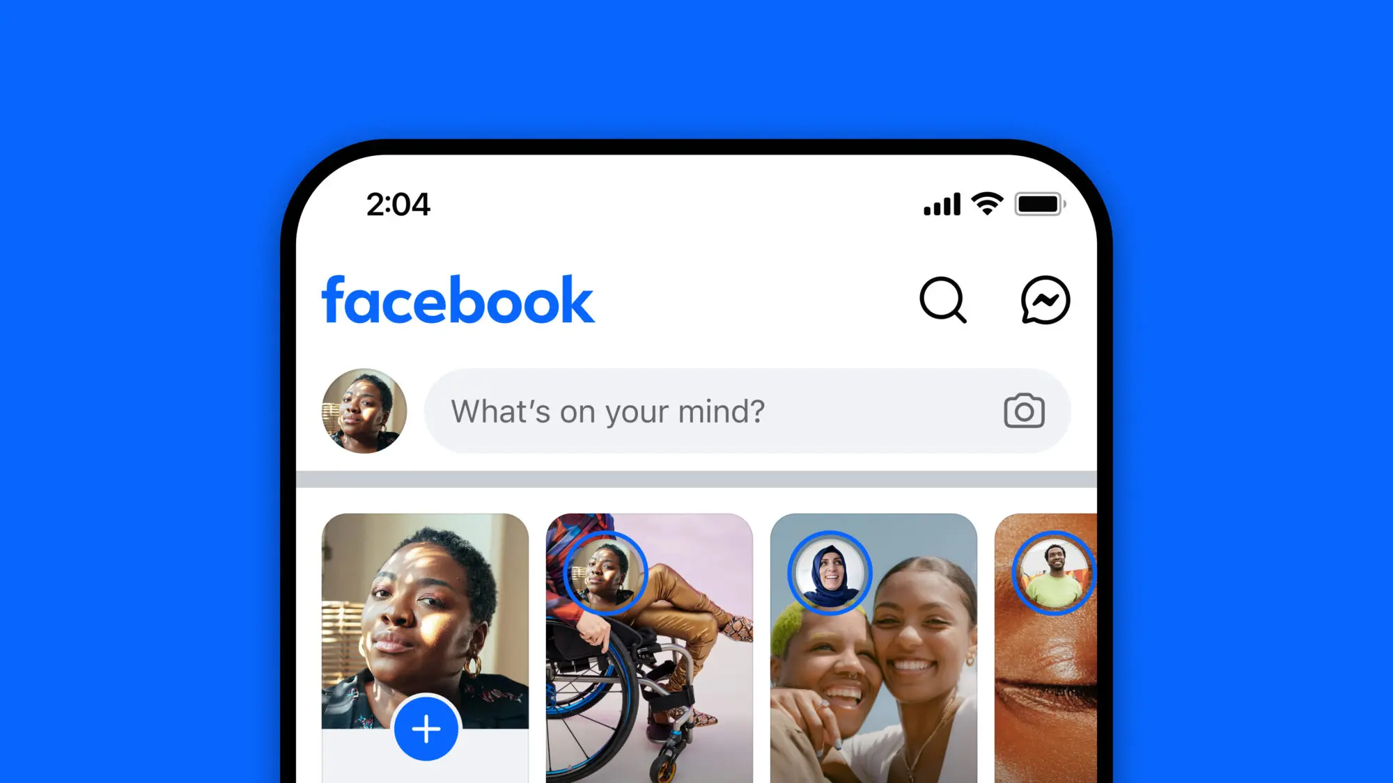
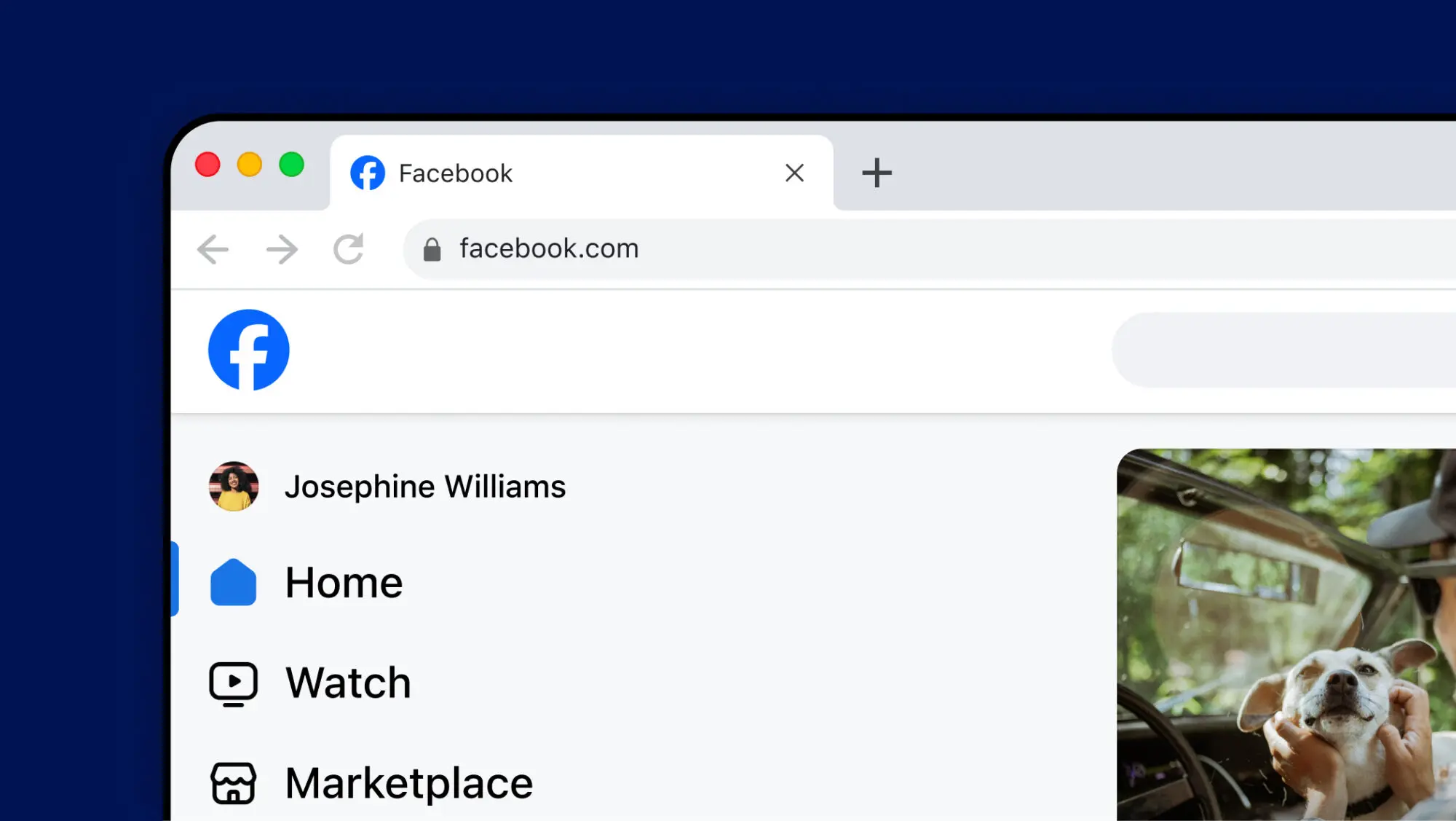
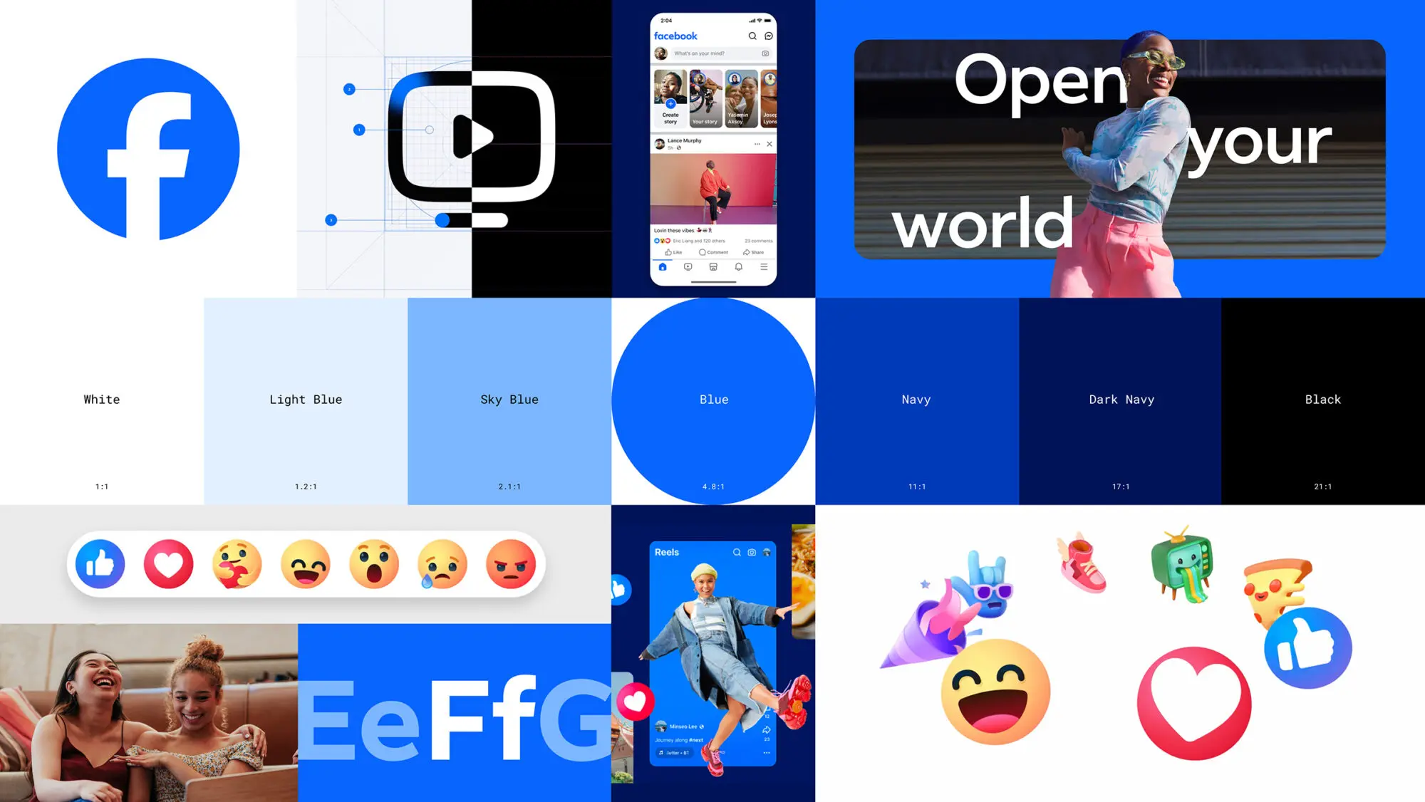
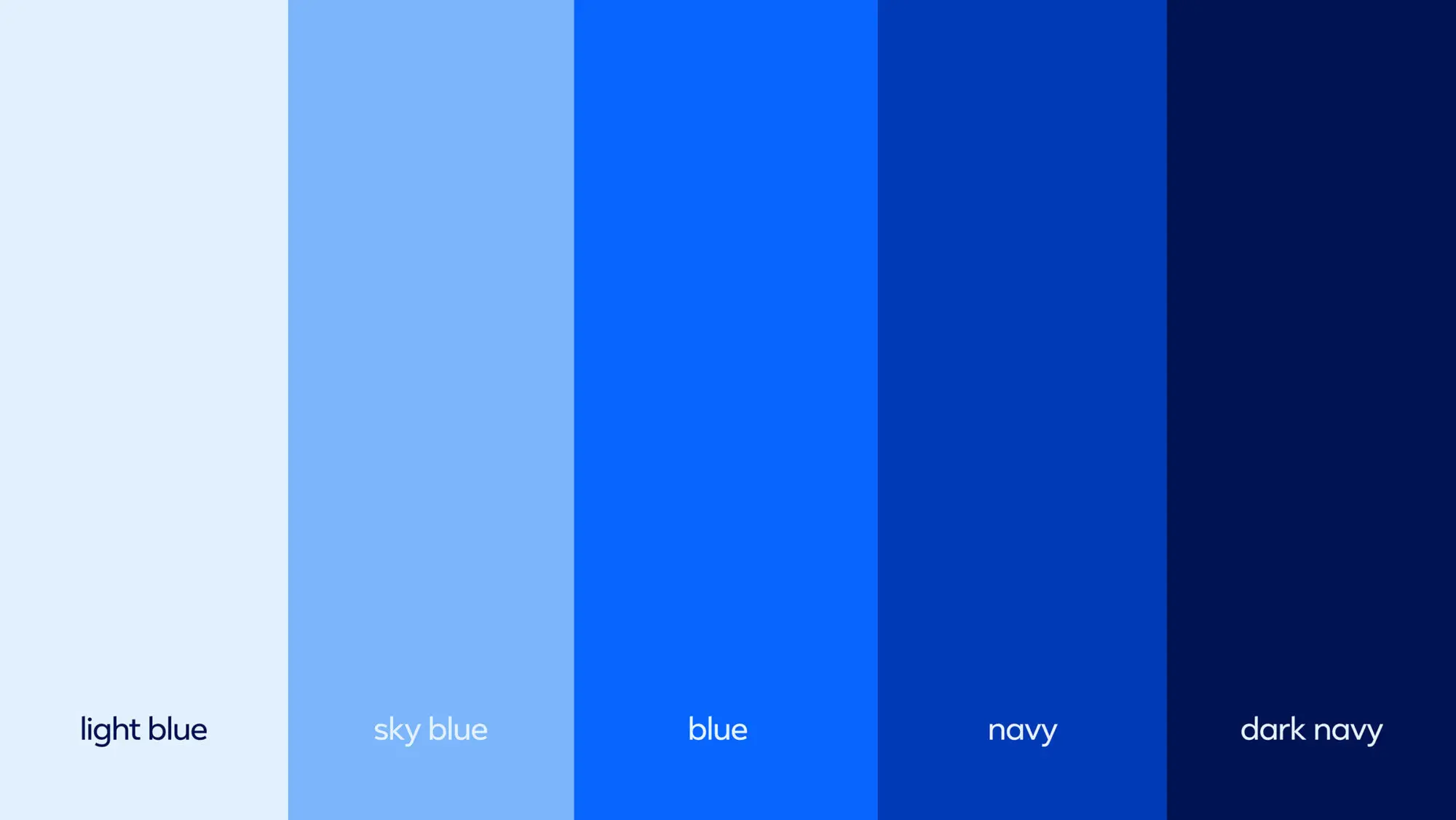
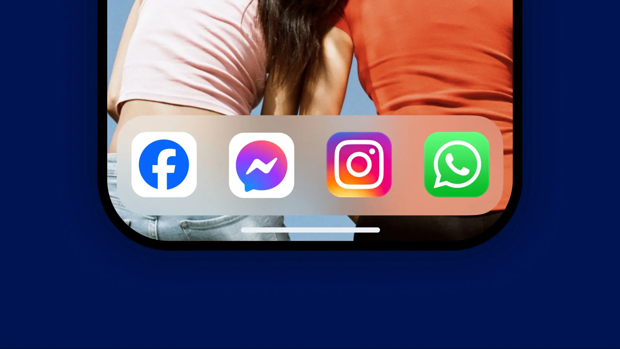
Testing the limits

We started by exploring the edges of what might be possible, pushing the current design assets into a more dynamic space, and delving into motion and dimensionality. Working in lockstep with the Facebook teams, we designed and tested hundreds of concepts, engaging in multiple stakeholder sessions to narrow them down. Then, we helped build a compelling case for change with their executives.

A new story of discovery 

With a new strategic positioning of ‘Social Discovery’ and the core idea of ‘opening up your world in both big and small ways’, we focused on infusing the new assets with a sense of expansion and purposeful integration into the product UI.

Elevation, not transformation

With a brand as globally recognizable as Facebook, used by over 2 billion people daily, the intention was not to transform the identity system but to move it forward by elevating its most iconic elements to add vibrancy and confidence.

Connecting people across the globe

High-level project aims were to unify how the brand comes to life across product and marketing experiences, expand and enhance the color system, and introduce a new consistent typeface, Facebook Sans, across all instances of logo, wordmark, marketing, and product UI. Our work ensures greater accessibility and legibility across all applications through type and color use.

We are thrilled to have been part of evolving this truly iconic brand and look forward to seeing it continue to bring together people from all around the world, helping them to discover more (in both big and small ways).

‘Redesigning the design identity for an iconic brand is no small feat. Through our partnership with Moving Brands, we were able to amplify the creative exploration by closely collaborating with their amazing team as an extension of our own. Through their dedication to craft and thoughtfulness, we were able to shape the next chapter for Facebook.’
Dave Nguyen
Design Director, Facebook