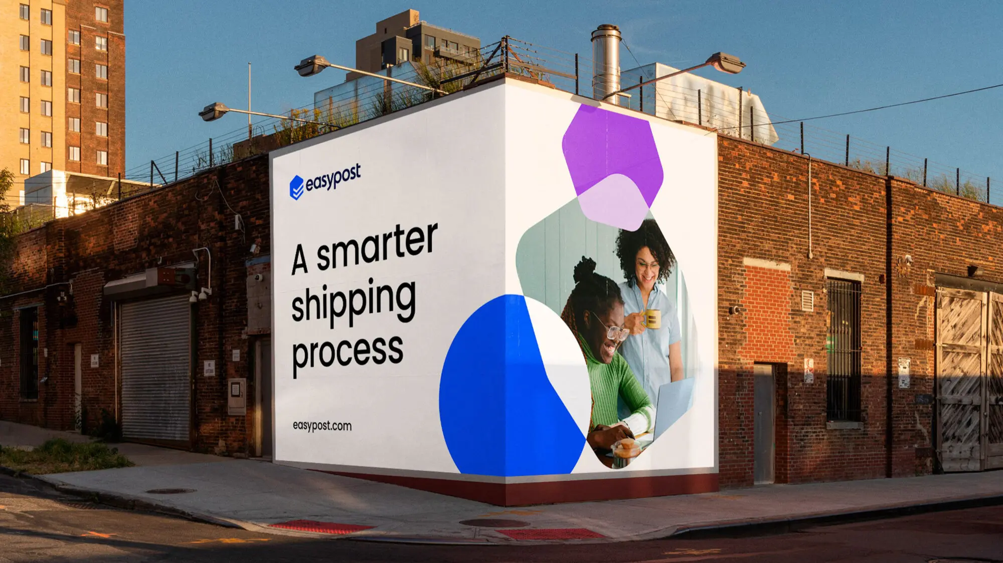
A billboard advertising a smarter shipping process. It sits on the corner of a building, giving it the feeling of a square package.

Crafting a winning identity

Having been through several unsuccessful rebrands since conception, they approached Moving Brands to help define and create a solid brand identity that supported their output, improved their website, and developed their marketing and sales tools for maximum effect, establishing a brand that would excel across all media.
Five web pages showing the new brand in action.
The new EasyPost wordmark on a blue sports car.

A story of partnership and connection

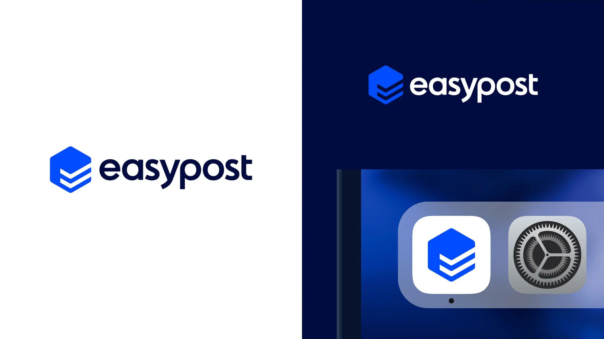
The new identity builds on EasyPost’s technological capabilities while telling a story of partnership and connection. At its heart is the new symbol, an abstracted isometric ‘E’ form with inherent qualities of a parcel and a unique double check mark emblem which speaks to packages being ‘sent’ and ‘delivered’.

The package-like symbol as an app icon.

Positioned as leaders

Newly positioned as a cutting-edge industry leader, EasyPost’s brand symbol, tagline, graphic language, and story now reflect this transformation.

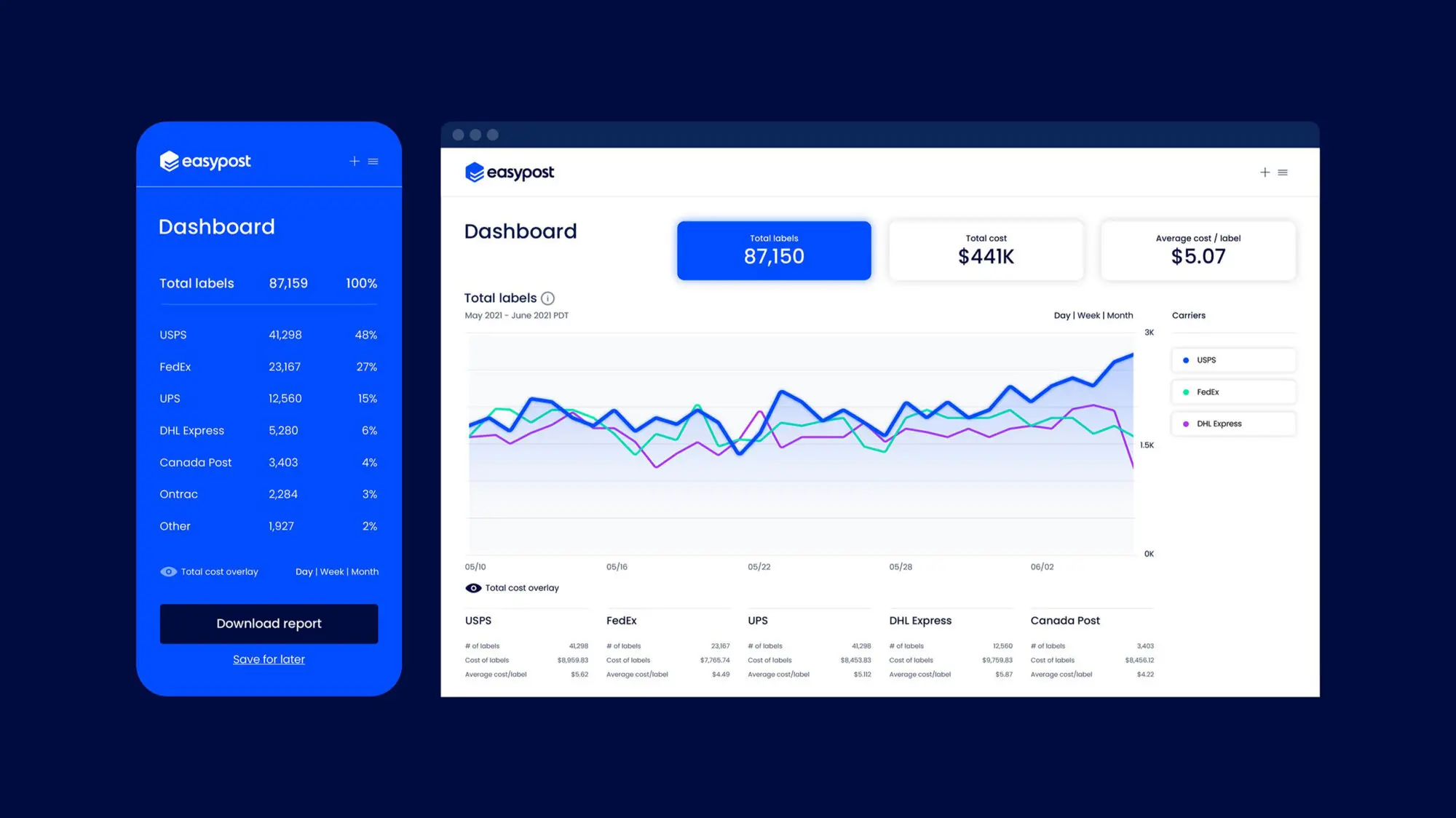
A dashboard with a blue background and a graph, illustrating the brand expression.
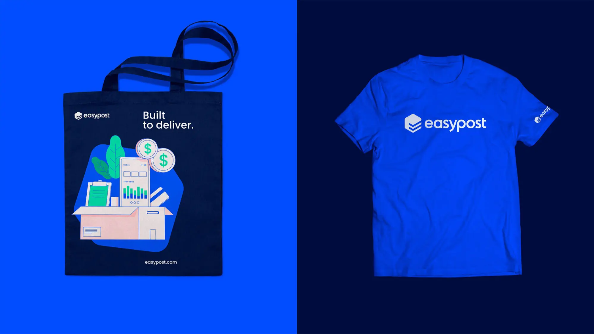
A branded tote bag that says