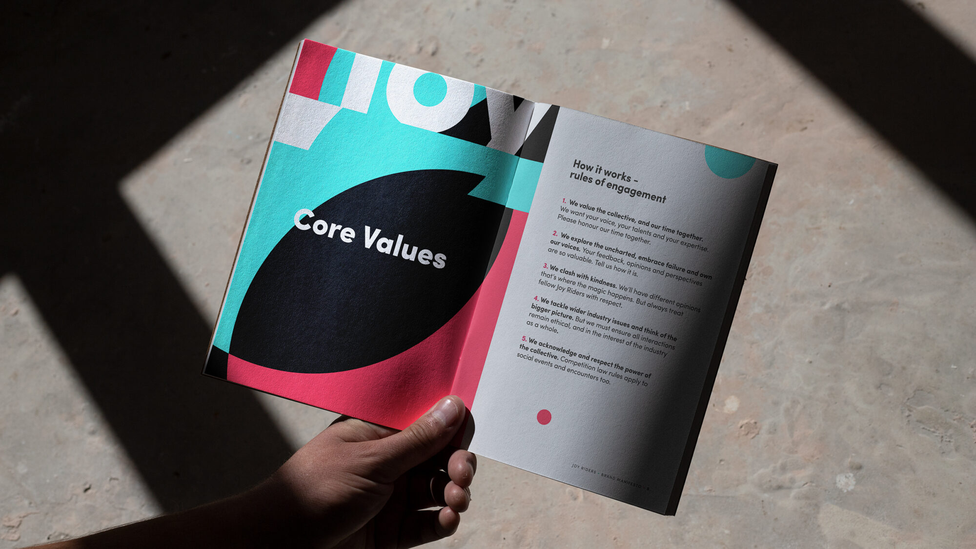
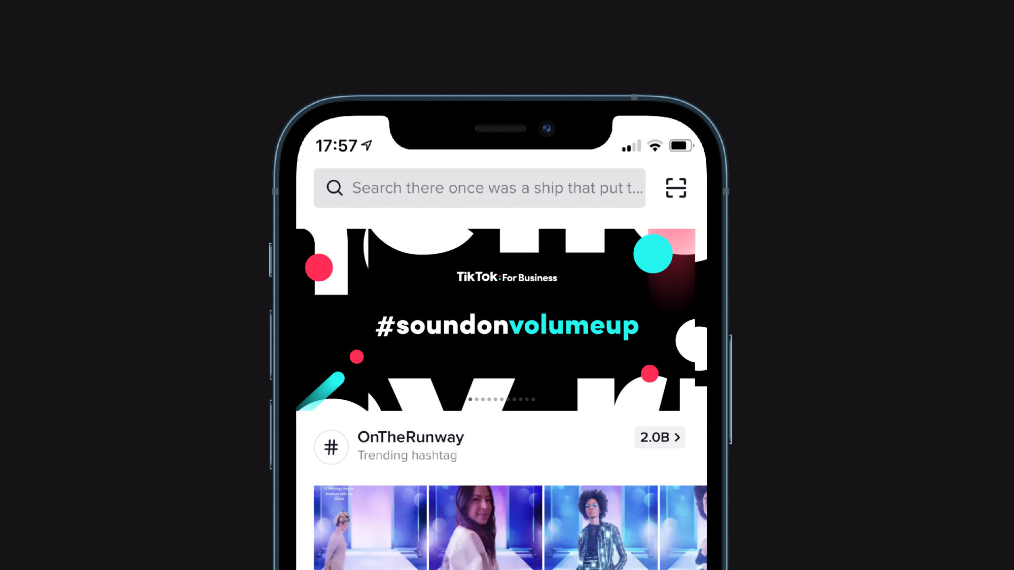
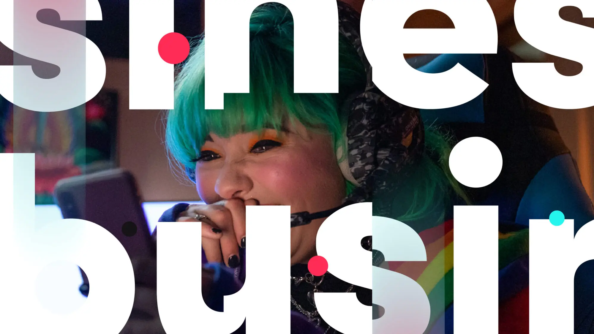
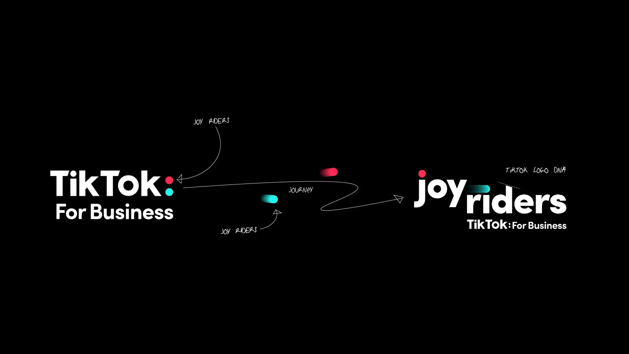
Built on the TikTok dots

The visual identity for Joy Riders was built from the dots of the TikTok For Business brand and inspired by the TikTok app and its unique editing effects. We created a bold and joyful look and feel that remixed TikTok For Business, and also represents an arena where the collective’s views can ‘clash with kindness’.

A collective, not a council

We started with the name. ‘Council’ was far too formal a word for TikTok. Joy Riders speaks to the initiative’s energy and positivity. We defined a proposition that conveys the crucial values Joy Riders brings to its members and their businesses. Our brand story conveys how Joy Riders operates as a ‘collective’ — a key word we proposed to describe the nature of the initiative — of members bouncing ideas off one another to shape the future of the business.

Say hello to Joy Riders

As well as a style guide and assets, we created a welcome video for the collective’s first session, a wide variety of print collateral and branded merchandise, including some Beats headsets for the launch.