Tea/Logo animation

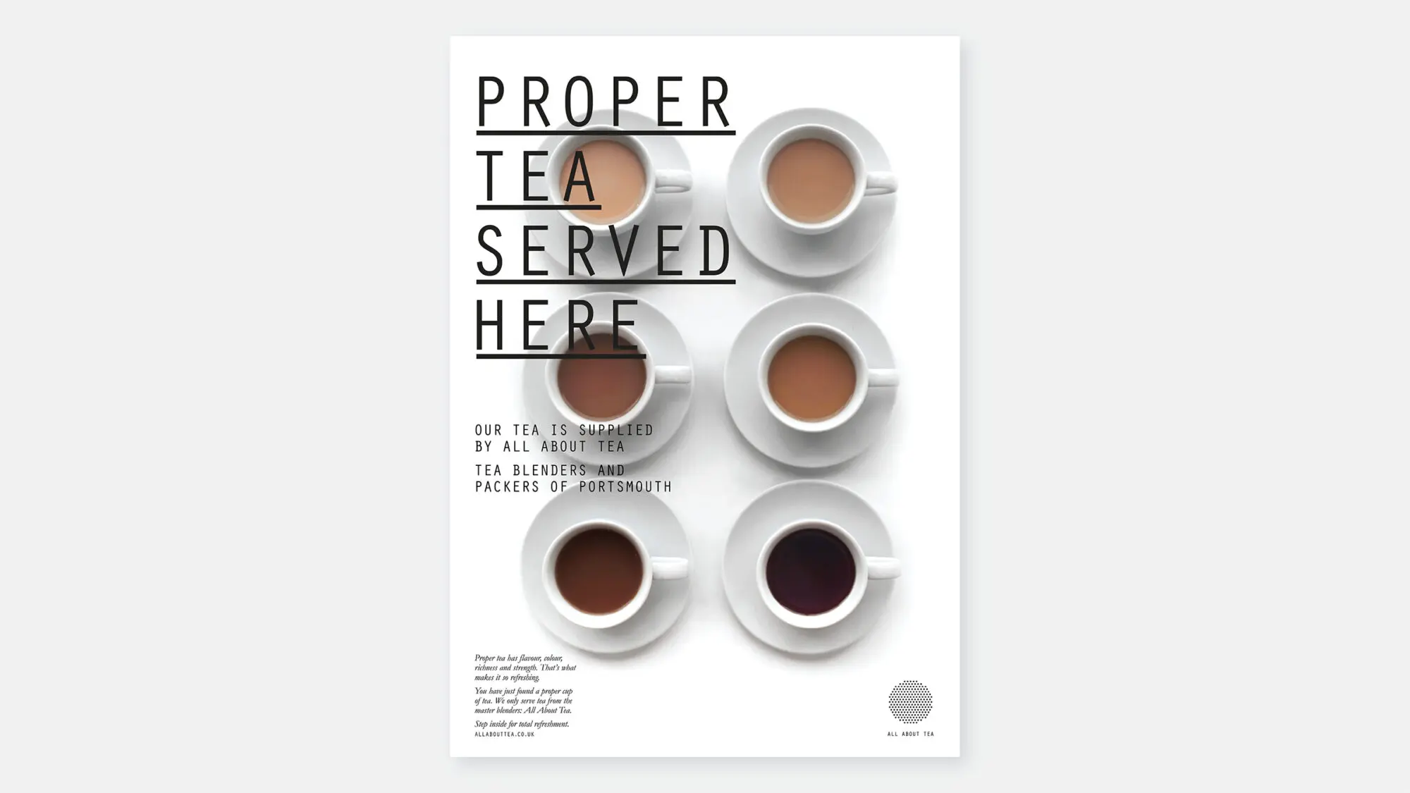
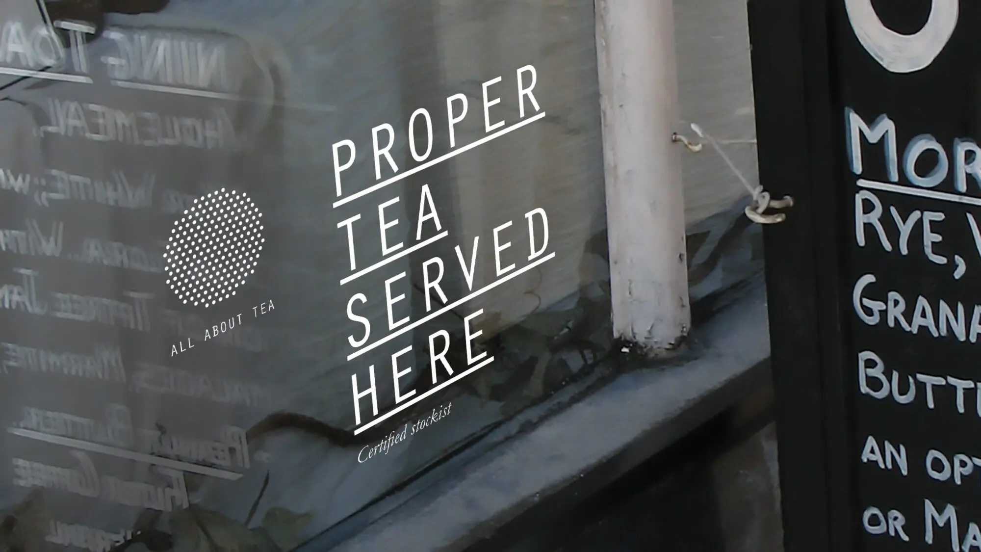
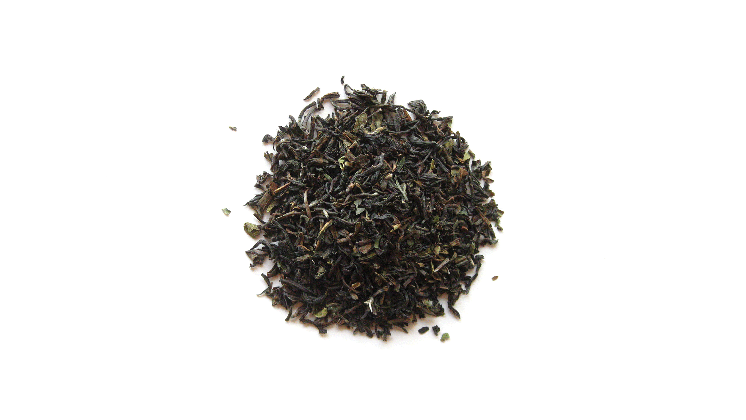
Tea takes centre stage

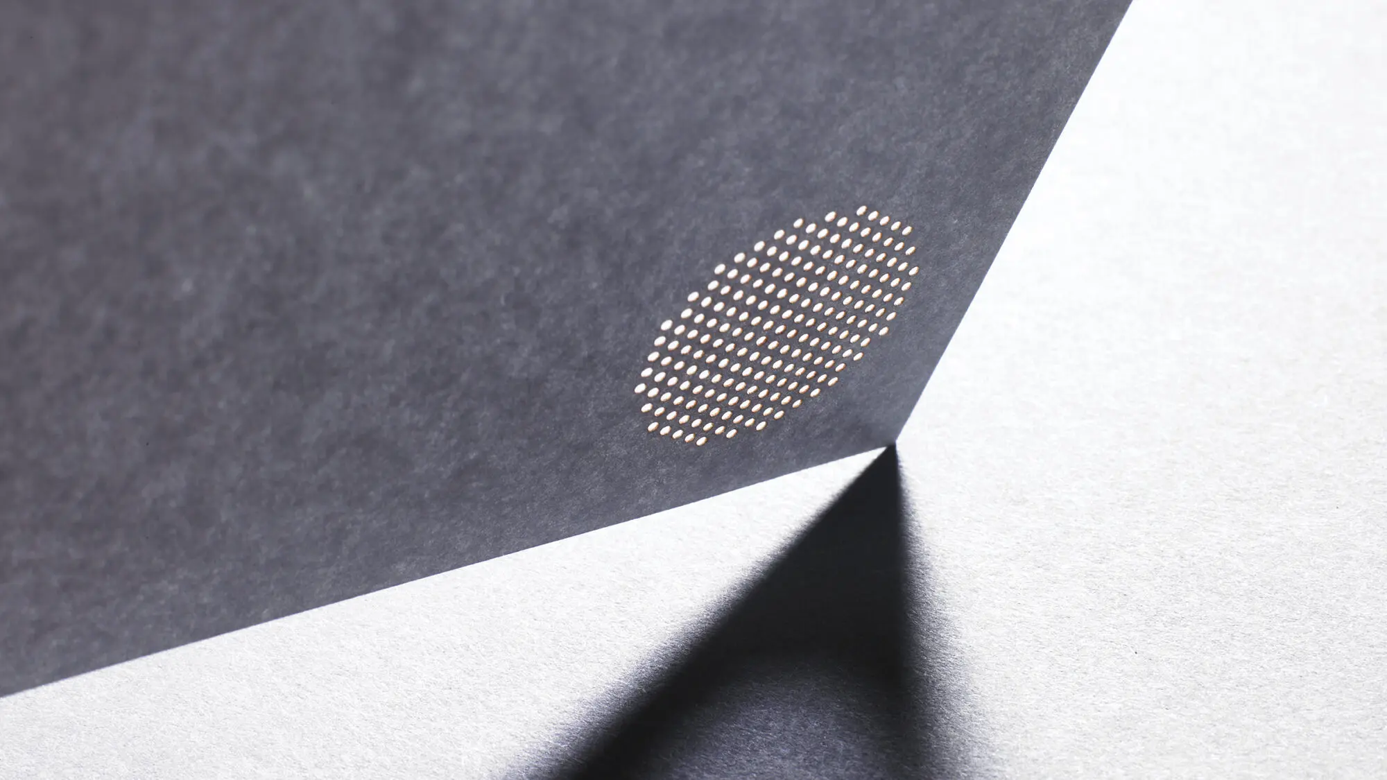
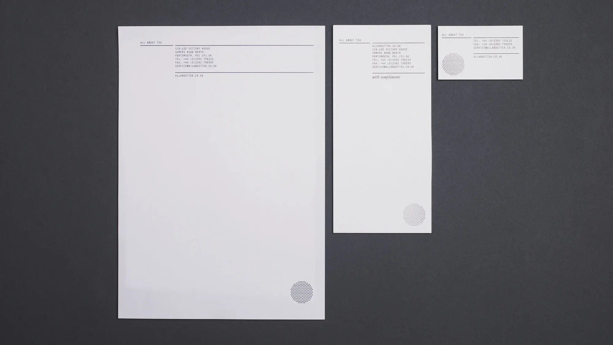
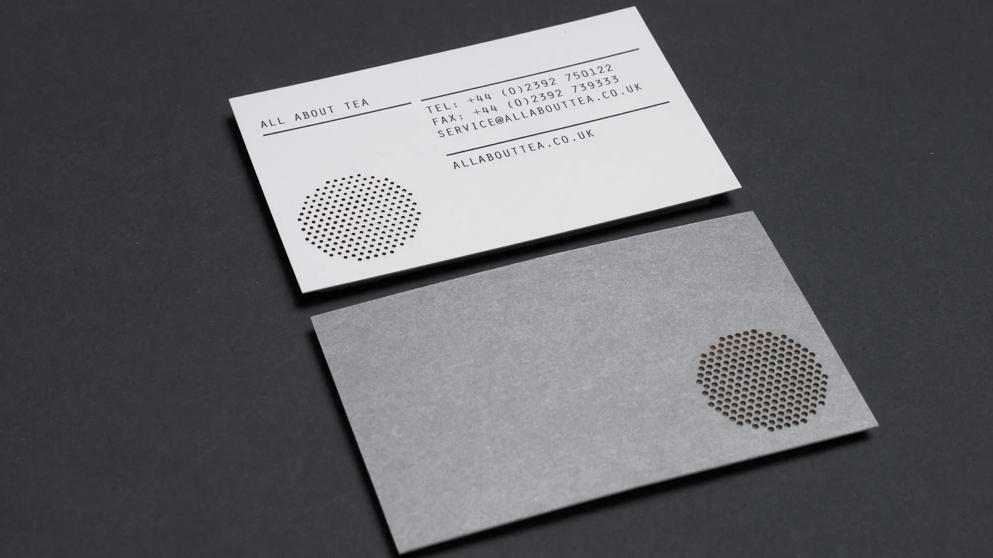
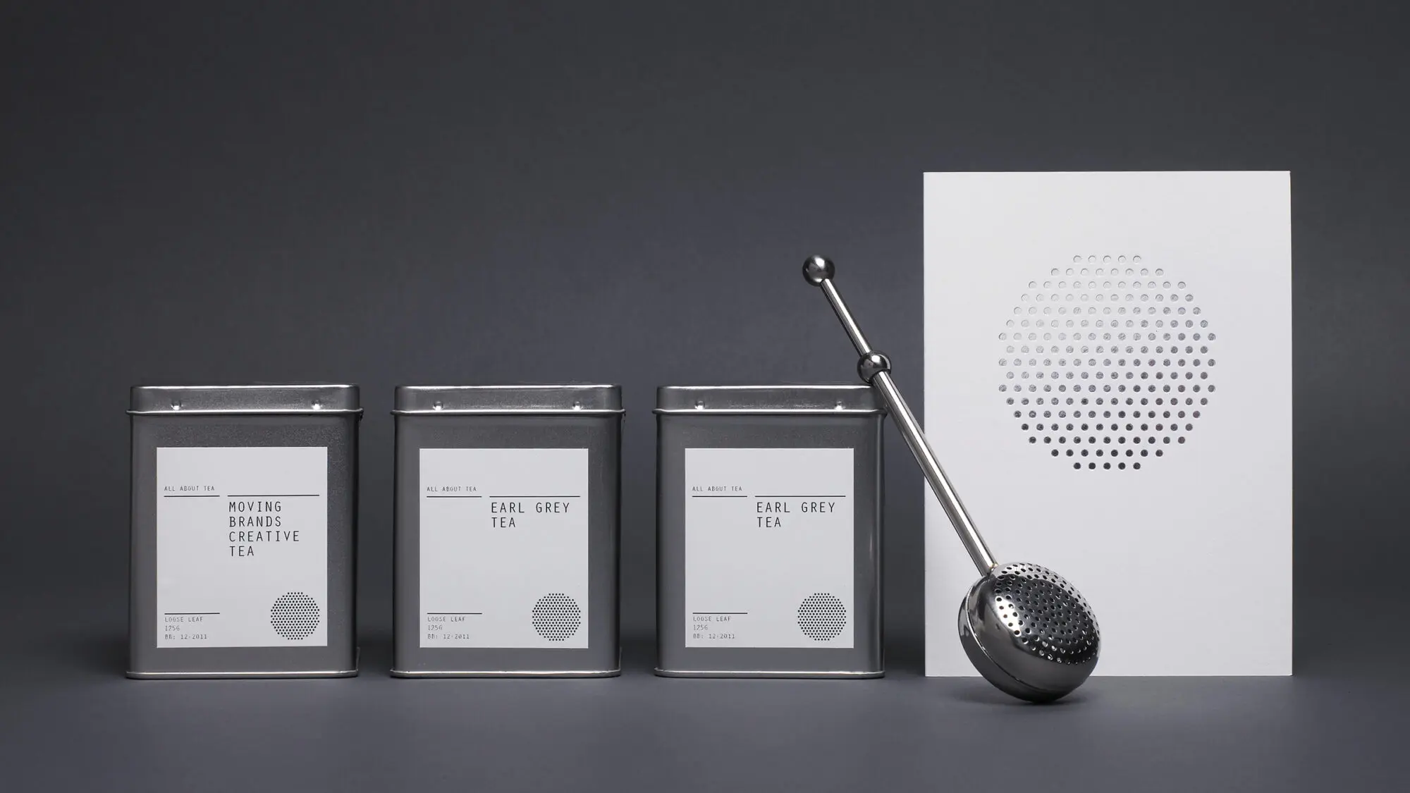
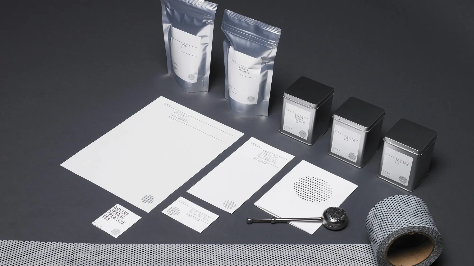
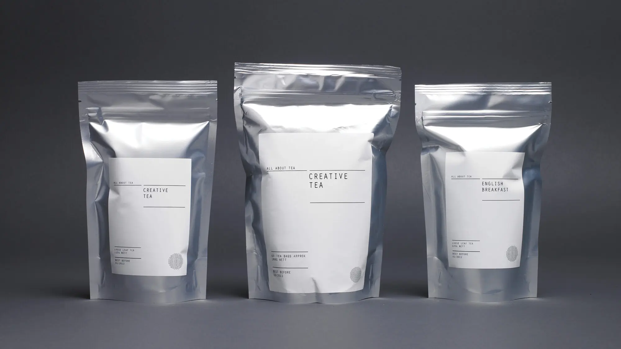
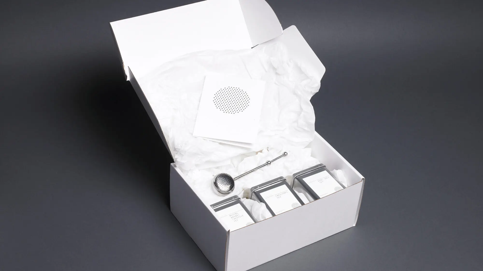
Making tea itself the hero of their new brand story, the mark we created reflects the process of making tea — the blending and straining. Its shape also evokes a seal or stamp — an iconic industry standard — and is used in this way as a stamp of quality across various applications.

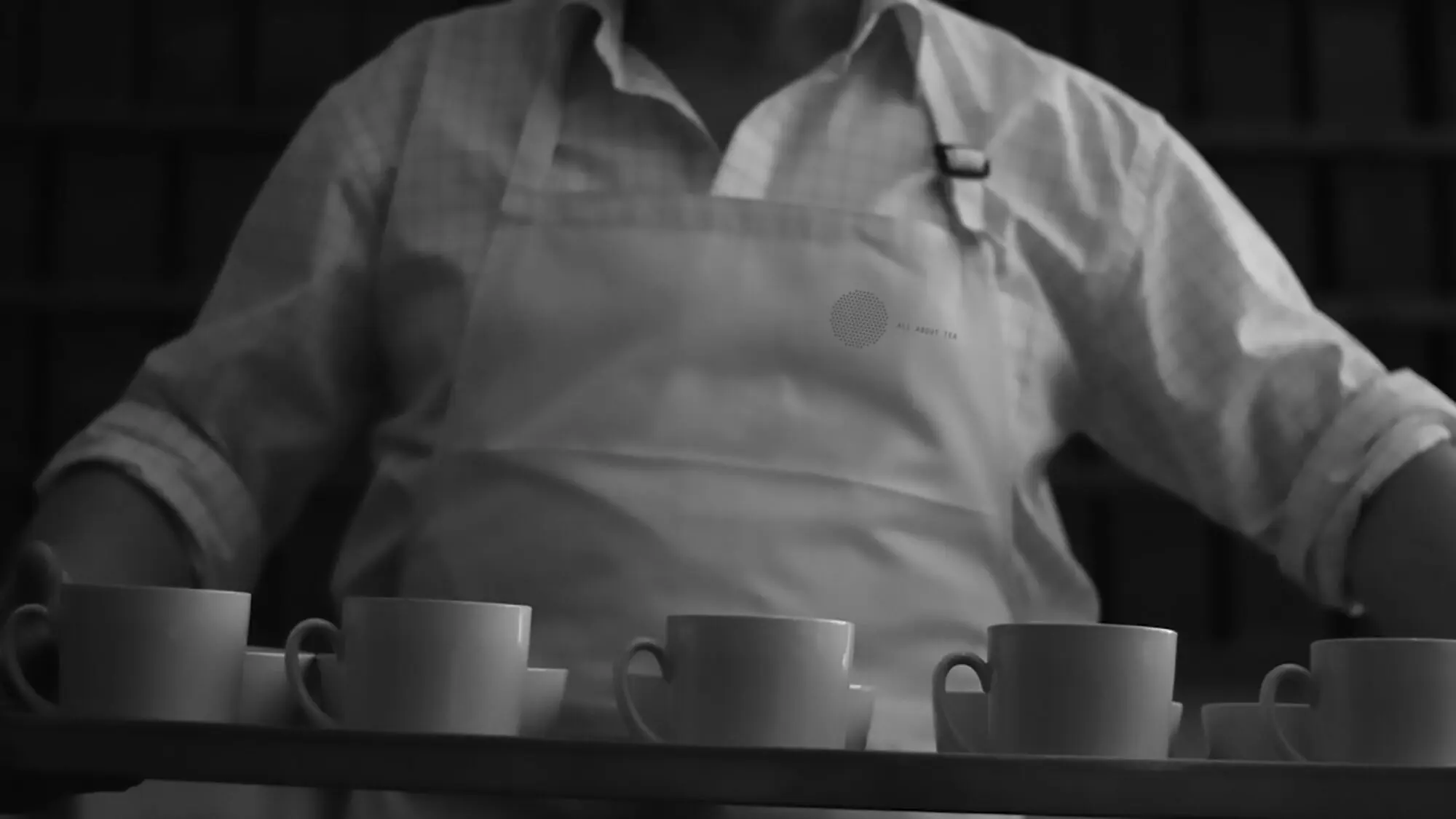
We laser cut this symbol for all print applications, texturally inspired by the tools for making and distributing tea.

Logo detail

Brand expression through typography

Orator, a mono-spaced typeface, was chosen to reflect the uniform spacing of the mark, as well as reference the utilitarian infographics associated with import and export. The typeface strengthens the ideas behind the metronomic process of the company’s offer.

The secondary type, Garamond italic, represents the founder’s expert voice. More fluid and conversational, it balances the strength of Orator by bringing out the quirks and passions of the organisation.

Window cling

Standing out from the crowd

The colour palette is black, white and silver further reflecting the efficient approach of the new identity. This monochrome palette set All About Tea apart from competitors dominated by browns, greens, and tea leaves.

Award

Award-winning impact

The All About Tea rebrand had an instant impact: average order values soared by 105% for business customers and 36% for personal customers while website traffic leapt by 56%, with total page views 236% above benchmark sites.

The work has won numerous design awards, including a Cannes Gold Lion, an AIGA award, a European Design Award, and an ADC award.

Photography
‘The process leading up to the actual design work was nothing short of a total redefinition of what the company is and what we do. The skill of the Moving Brands designers was in encapsulating this redefinition accurately in visual form. Since implementing the new identity we have literally not been able to keep up with the increased interest from new customers.’
Andrew Gadsden
Founder and CEO, All About Tea