Close collaboration
We worked closely with their senior team to articulate and reflect their paradigm-shifting vision, strategically positioning the brand as disruptive and rebellious yet accessible.
Bringing fintech axo's frictionless and fair crypto market vision to life
Formerly known as Maladex, axo is a decentralised trading platform on a mission to become the most efficient, sound, and ubiquitous financial protocol on the planet.
We worked closely with their senior team to articulate and reflect their paradigm-shifting vision, strategically positioning the brand as disruptive and rebellious yet accessible.
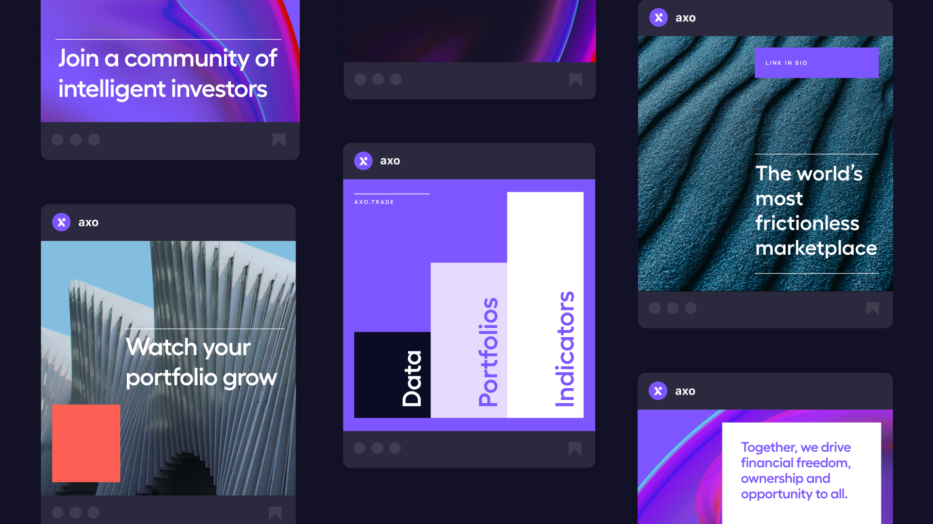
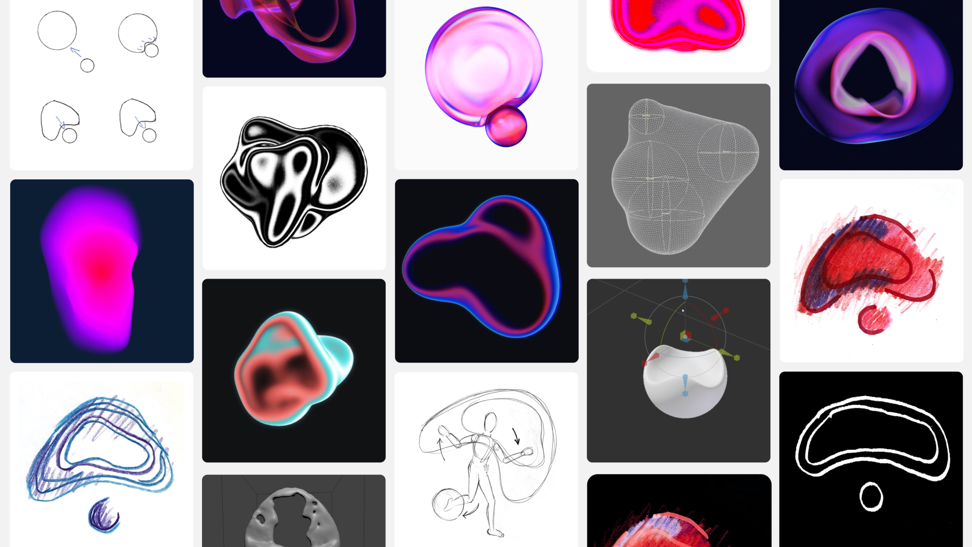
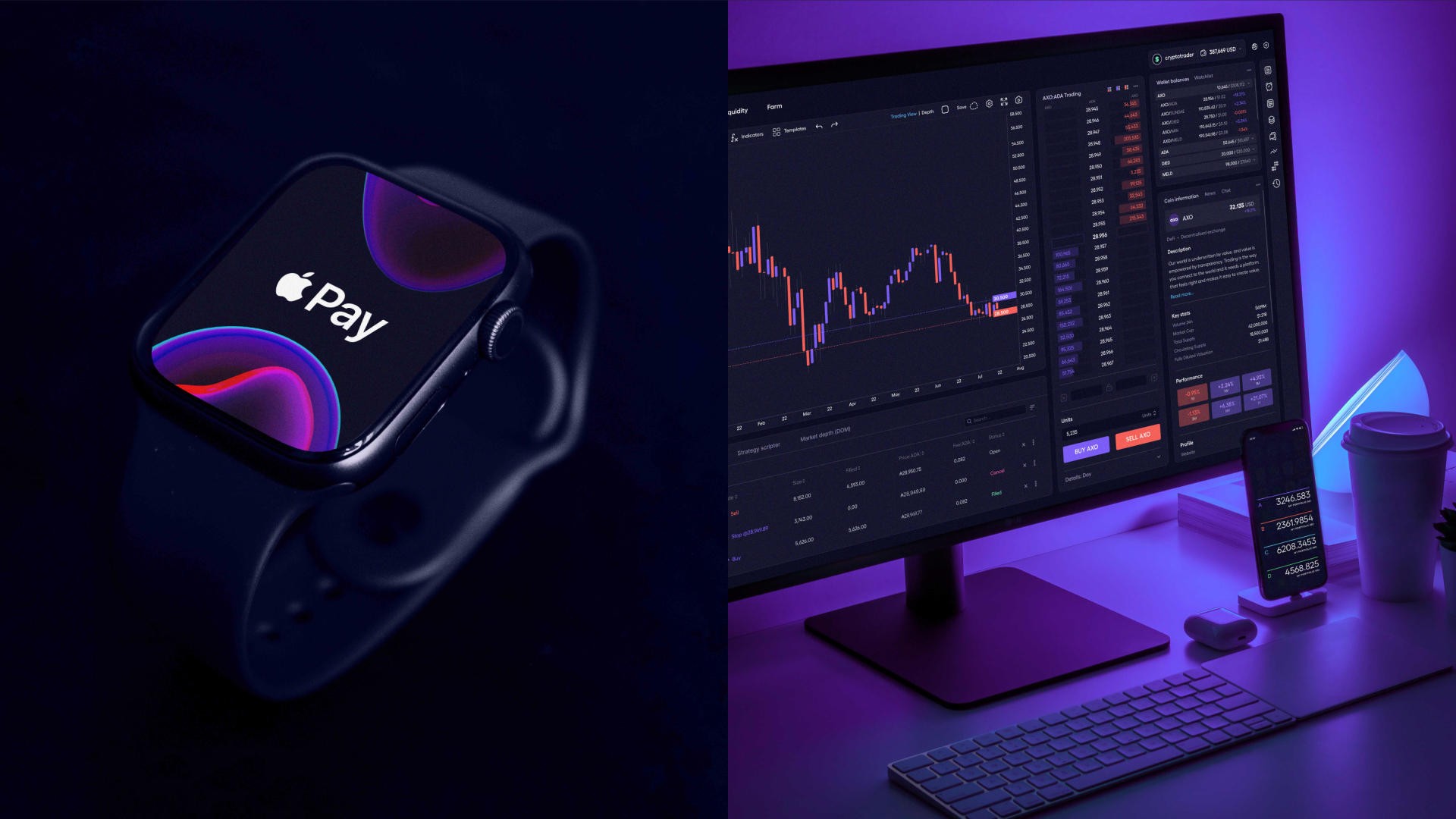
Ever mindful of their target audience of professional traders, we built a brand to reflect axo’s principles of delivering a fluid, frictionless and transparent experience. At its centre is the concept of an adaptive living texture, which represents the ever-changing axo markets and traders.
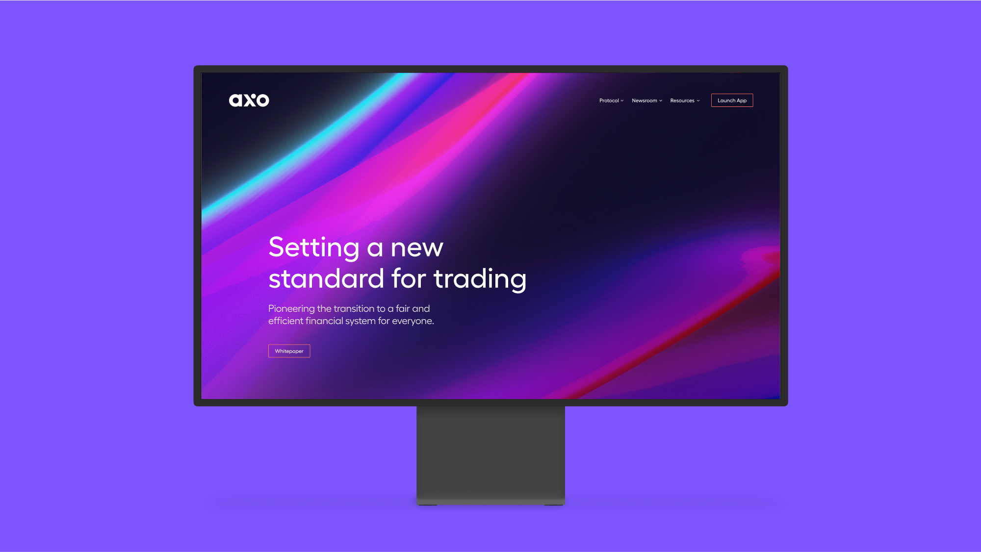
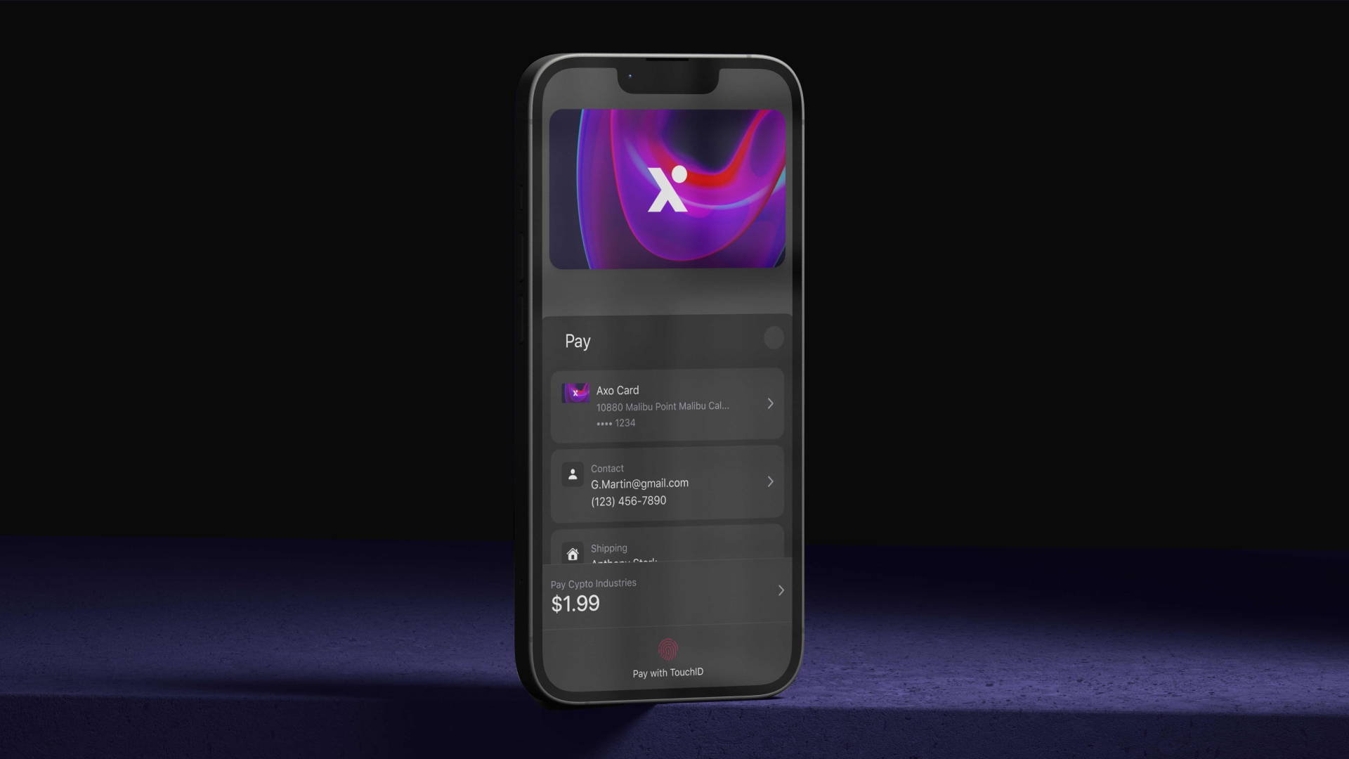
In a nod to the platform’s technical sophistication, the central ‘x’ in the axo logotype is based on a lambda symbol used in linear algebra, a core component of its coding.