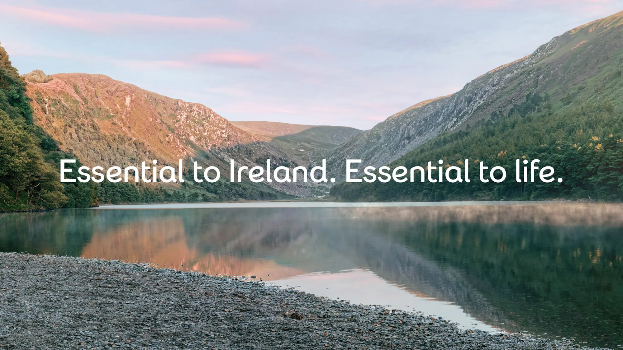
• eir
  • Telecoms
  • Branding

Breathing new life into Ireland’s principal provider of telecommunications services

Like many major players, Ireland’s largest telecoms
 business Eircom faced a period of profound change.
 Moving Brands was engaged as its lead creative partner,
 to clarify and streamline its business architecture and transform its brand identity, products and communication.

Share this

A changing role for the business and for Ireland
Eircom had invested heavily in the most extensive and fastest broadband network in Ireland. Its product portfolio is broader than any of its competitors, with the potential to connect with audiences of all ages across rural and urban Ireland.


A single masterbrand
Through the creation of one masterbrand, we provided the business with an architecture that both defined the changes it had already made and a framework for its continued evolution. Over a delivery schedule of only six months, we brought both the business and consumer units under the single ‘eir’ masterbrand.

We renamed the Eircom Wholesale offer ‘open eir’, and gave it a distinct tone of voice and colour palette. This helps customer navigation while aligning the offer closely enough to the masterbrand to retain brand equity.

A life-affirming brand story
The brand story we created to drive the business and galvanize eir's people is — ‘Essential to Ireland. Essential to life.’ To capture and communicate eir’s newfound energy and ambition, we created a teaser campaign ‘Live life on eir’, an uplifting and optimistic invitation to its customers – and the nation. This set the tone for the new brand’s vibrant and playful communications, such as ‘Change is in the eir’ and ‘Business rises on eir’. We developed guidelines for how eir’s upfront and upbeat voice comes through everywhere, from Twitter to in-store conversations.


A vibrant brand that captures the properties of air
A simple, bold brand system allows the business to create and deploy a range of vibrant, larger-than-life expressions. It conveys the shift from a supplier of infrastructure and services to an approachable, human, warm and positive business.


A typeface to convey the brand’s upbeat openness
We collaborated with type foundry Colophon to create a unique and bespoke headline typeface which conveys the brand’s upbeat openness. Designed to emulate the organic, single-line construction of the eir logotype, it is a simple, gestural script, with letterforms constructed in a few fluid movements.


Signifying a new promise to eir customers
The rebrand has offered a unique and timely opportunity to transform the business in its audience’s hearts and minds. The result is a confident brand that reflects and galvanises both the recent and ongoing evolution of the business, and the ambitious commitment to eir’s future competitive potential.


“The new eir identity reflects our real ambition to become 
a dynamic and progressive organisation, providing the 
high-quality infrastructure and services Ireland needs 
and deserves.”

Richard Moat, eir CEO

A digital toolkit for all environments
We created a digital toolkit to help the business grow from merely providing digital products and services to capturing customers’ imaginations with compelling content and memorable experiences. The toolkit allows eir to shape optimal customer experiences across all key digital environments (phone, tablet, TV and desktop). Our mobile-first approach extended the brand and its behaviours across the Four Screens (including TV EPG), creating digital interactions that are responsive and progressive. This user experience is also showcased in the interface design of the eir.ie site.