LogMeIn came to Moving Brands because they needed to transform from a ‘house of brands’ to a highly efficient and unmistakably differentiated ‘branded house’ unified under an all-new GoTo brand.
GoTo
Creating the new go-to brand for the new GoTo
GoTo is a leading provider of SaaS-based cloud services, with all-in-one phone, meeting, and messaging – providing connectivity, collaboration, and support solutions to help businesses thrive. In 2020, as LogMeIn, they were acquired by Francisco Partners and Evergreen Coast Capital, with a valuation of $4.3 billion.
- Brand Identity System
- Brand Launch & Activation
- Brand Architecture
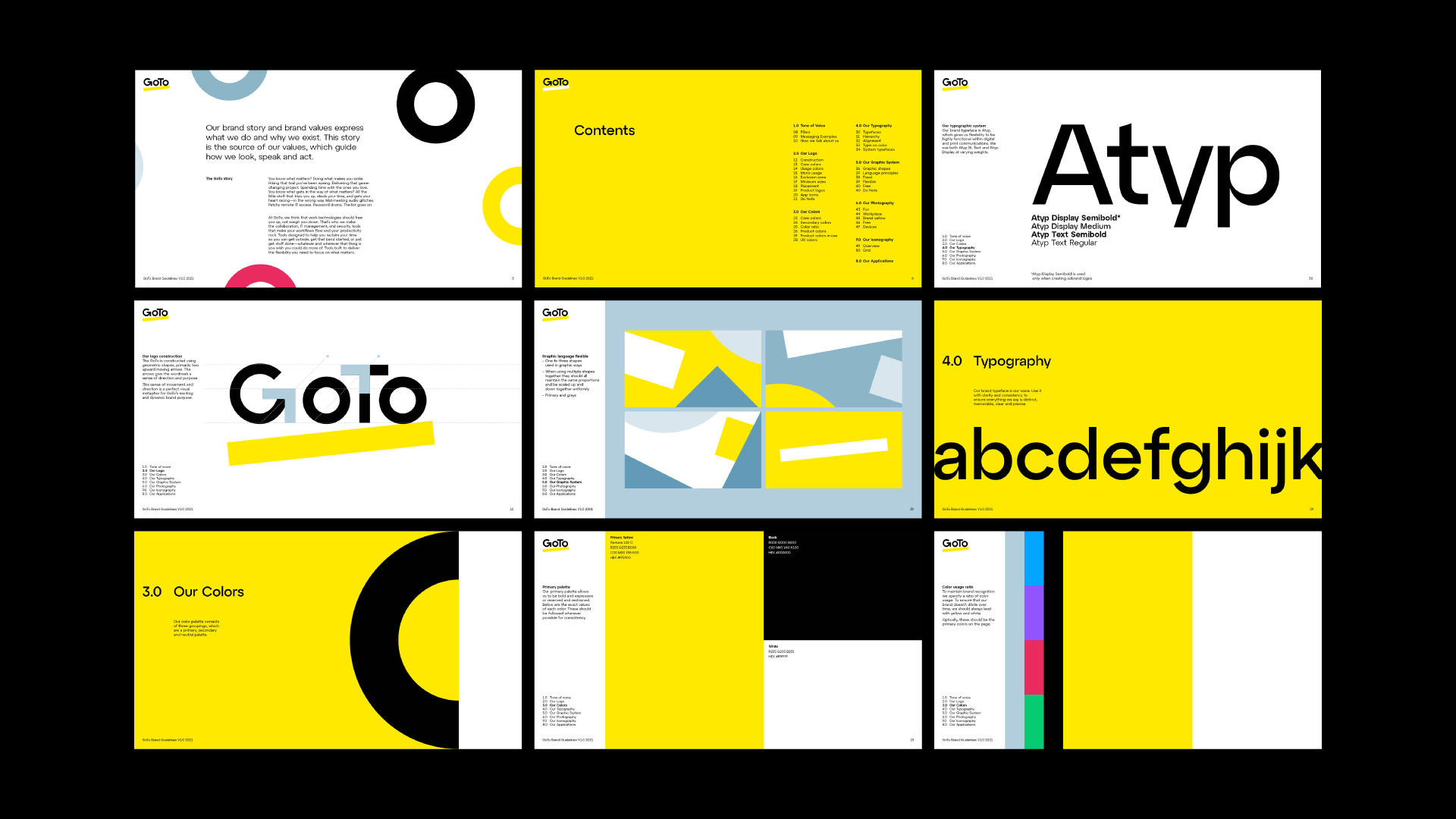
- Brand Assets & Guidelines
- Brand Localization
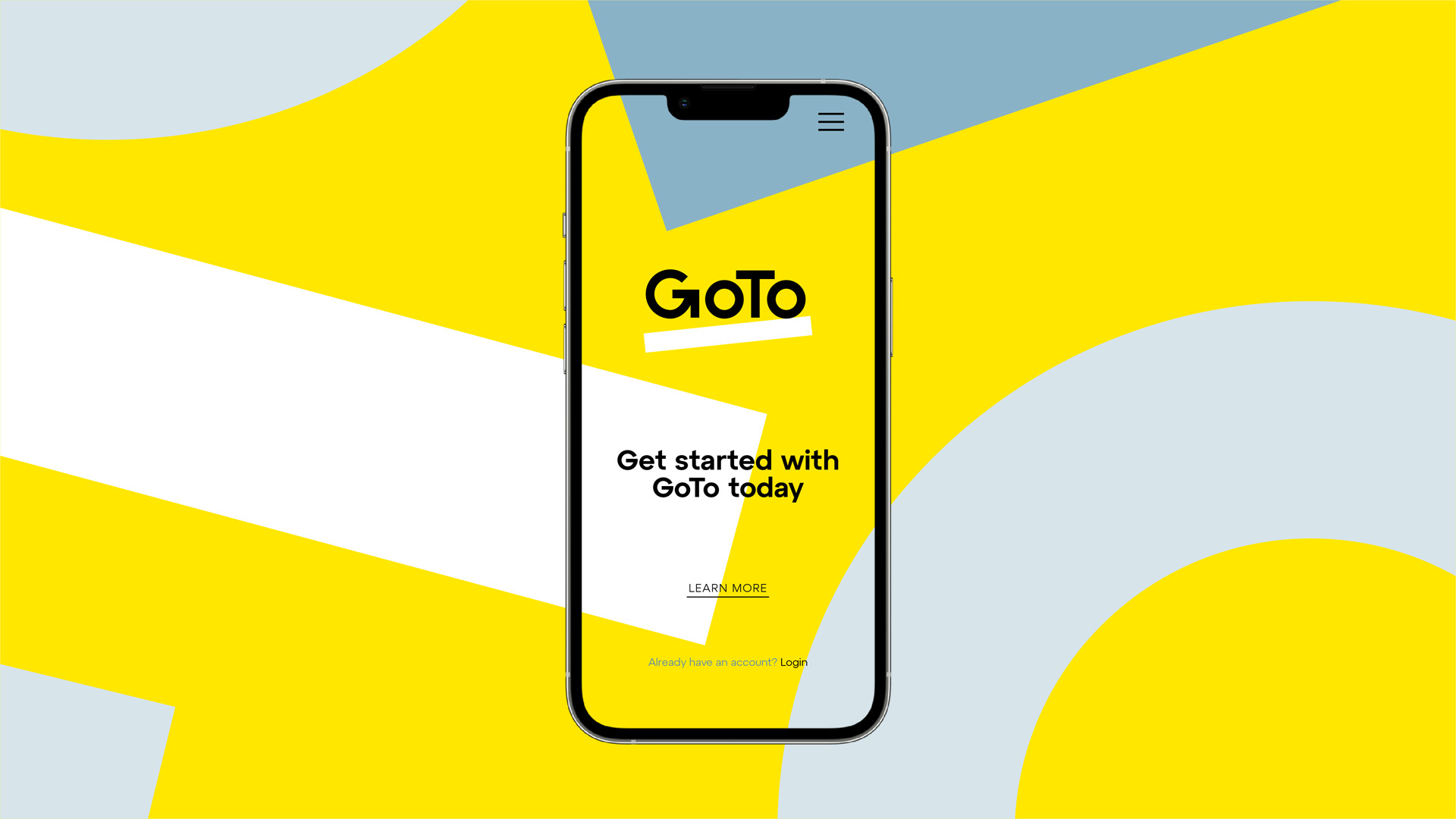
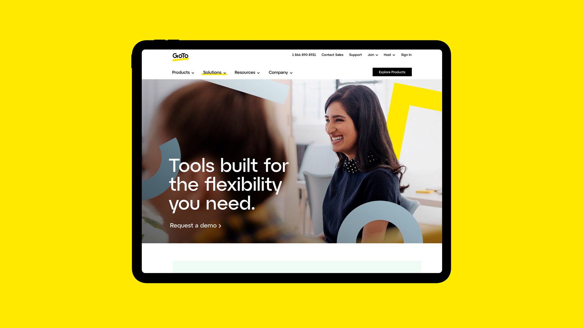
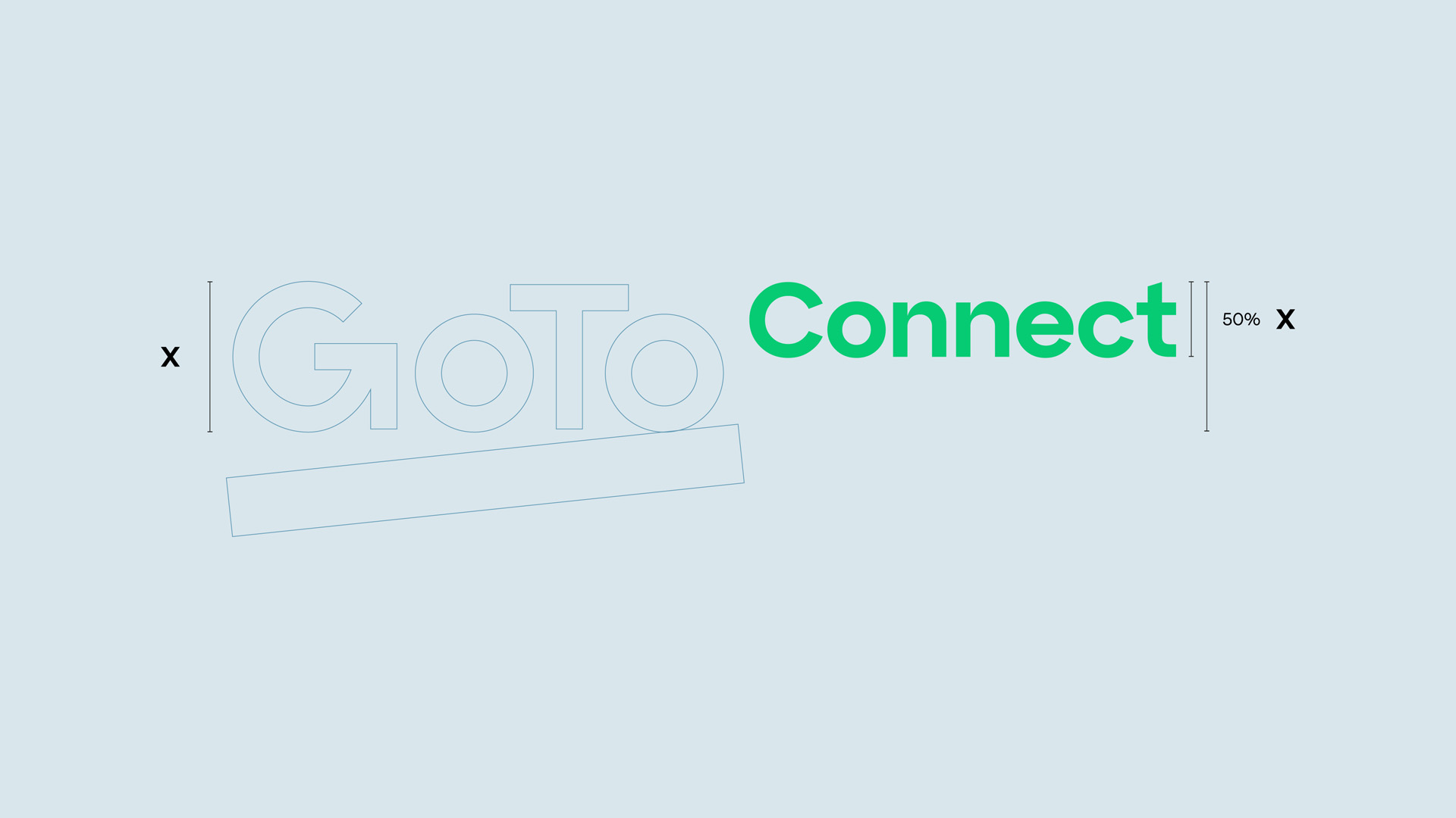
An identity to drive global growth
We partnered to reposition GoTo, reorganise and simplify their product portfolio, and create an iconic, flexible brand identity to enhance customer experiences and drive international business growth. Working together, we developed a brand strategy and story, moving on to define both brand and naming architecture to bring clarity to a previously complex portfolio of products and services.
The perfect name
We chose the name GoTo from within LogMeIn’s array of existing branded offers – it perfectly captures their essence as the ‘go to’ partner for communications, collaboration, and IT solutions.
Standing out in multiple markets
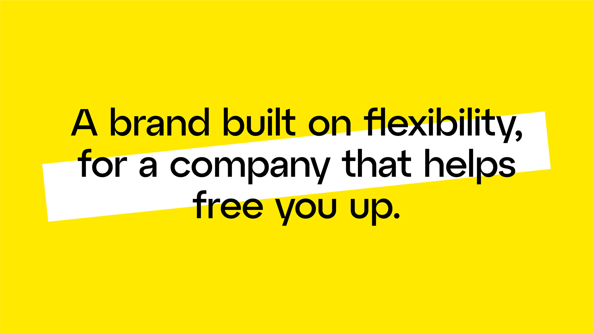
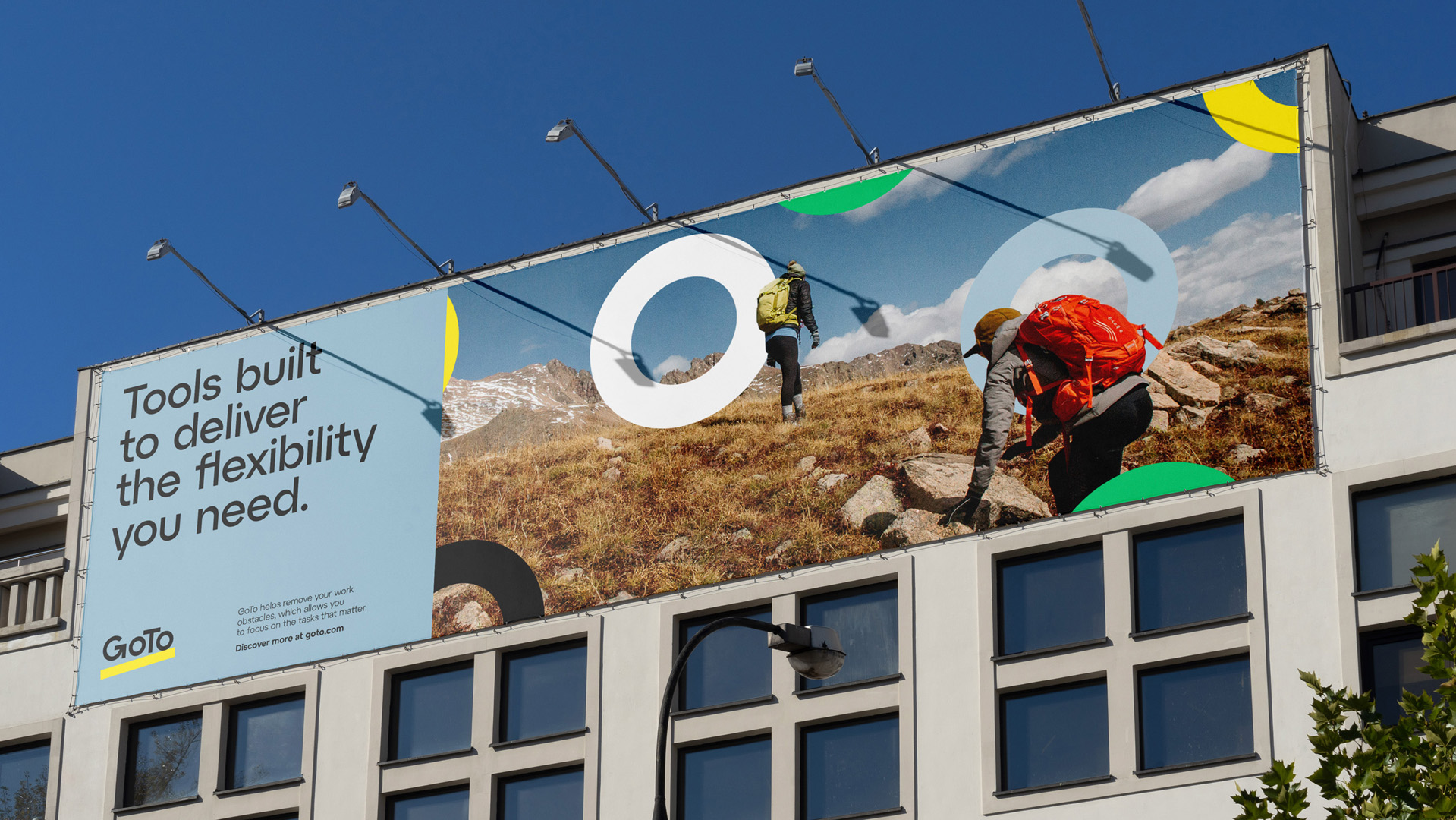
Recognising their need to set themselves apart, our vision for the brand centred on a distinct logo and the colour yellow, which our competitive audit had identified as a unique differentiator.
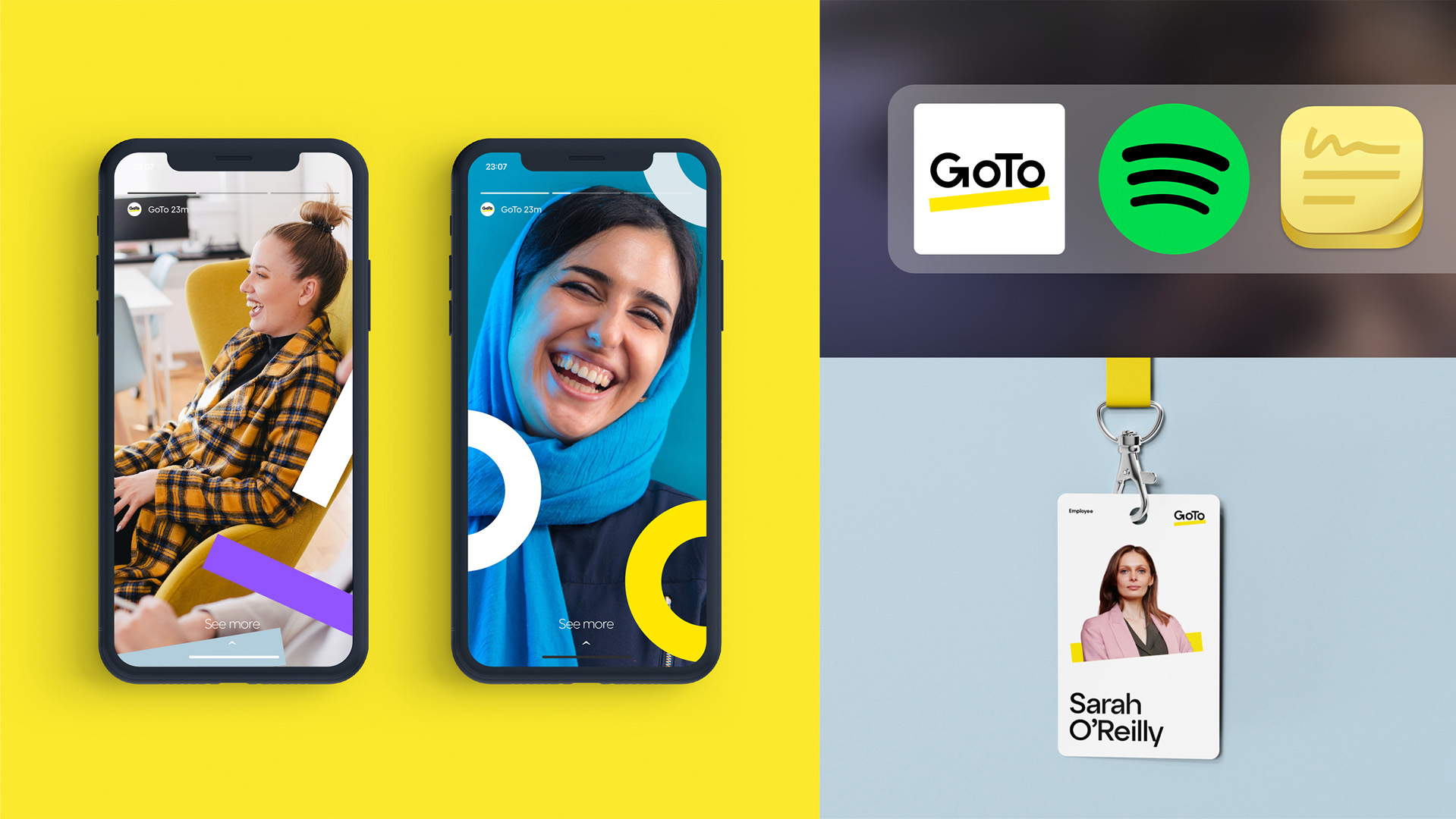
As well as designing their complete identity system, including tone of voice, messaging, typography, iconography, photography, motion and sonic logos, we developed comprehensive brand localisation guidelines for eight markets.
‘We’re thrilled to get to this point in the journey, and while we’re only at the beginning of this transformation, it’s a big milestone. We believe we have such a solid, enduring brand – our many thanks to Moving Brands for your work.’Nathaniel Eberle Senior Director of Brand & Creative, GoTo