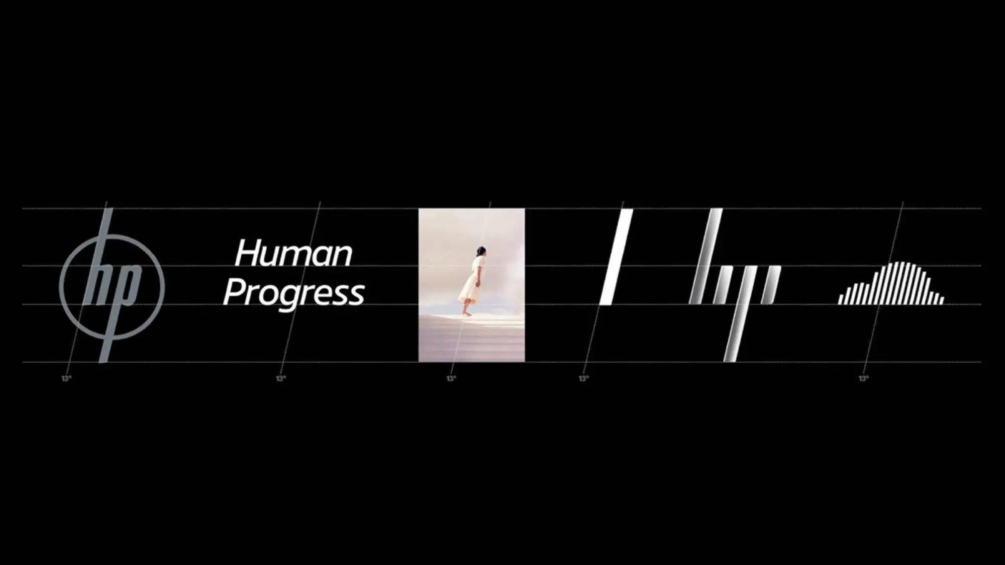
HP stands for Human Progress
This enduring truth – that HP stands for something much greater than its devices and services, is articulated, simply and memorably, as Human Progress. And this was the fully-fledged vision we created for HP’s future.
A vision to propel HP into the future
As HP’s lead creative partner, we developed a 10-year vision for the tech giant. The ambition was to transform the world’s largest technology company into the world’s most powerful brand – a blueprint of a brand built for the moving world.
This enduring truth – that HP stands for something much greater than its devices and services, is articulated, simply and memorably, as Human Progress. And this was the fully-fledged vision we created for HP’s future.
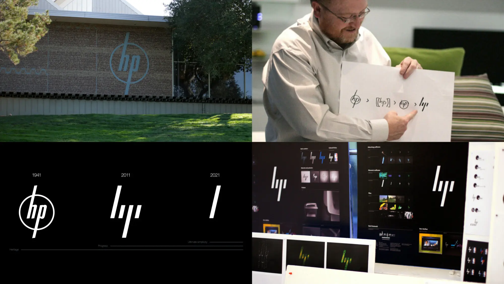
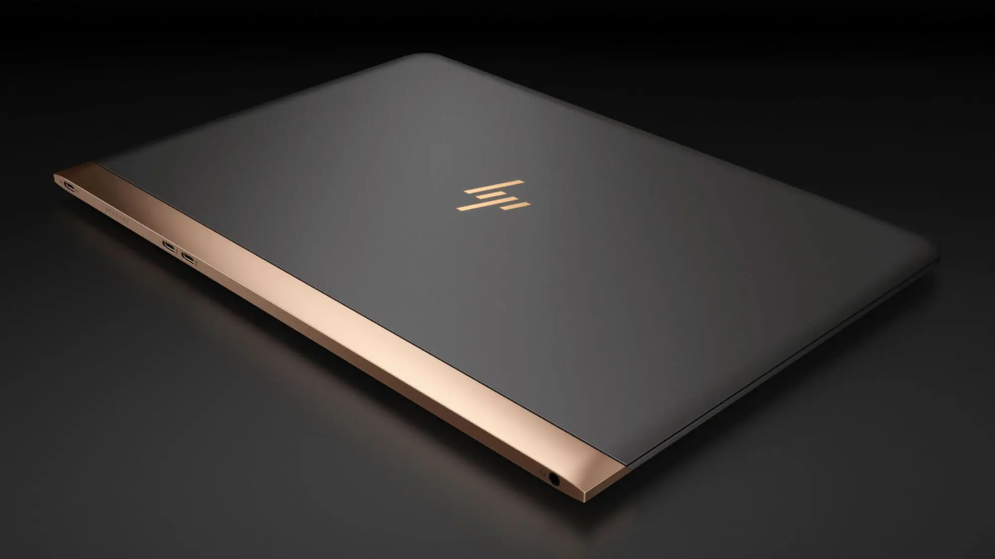
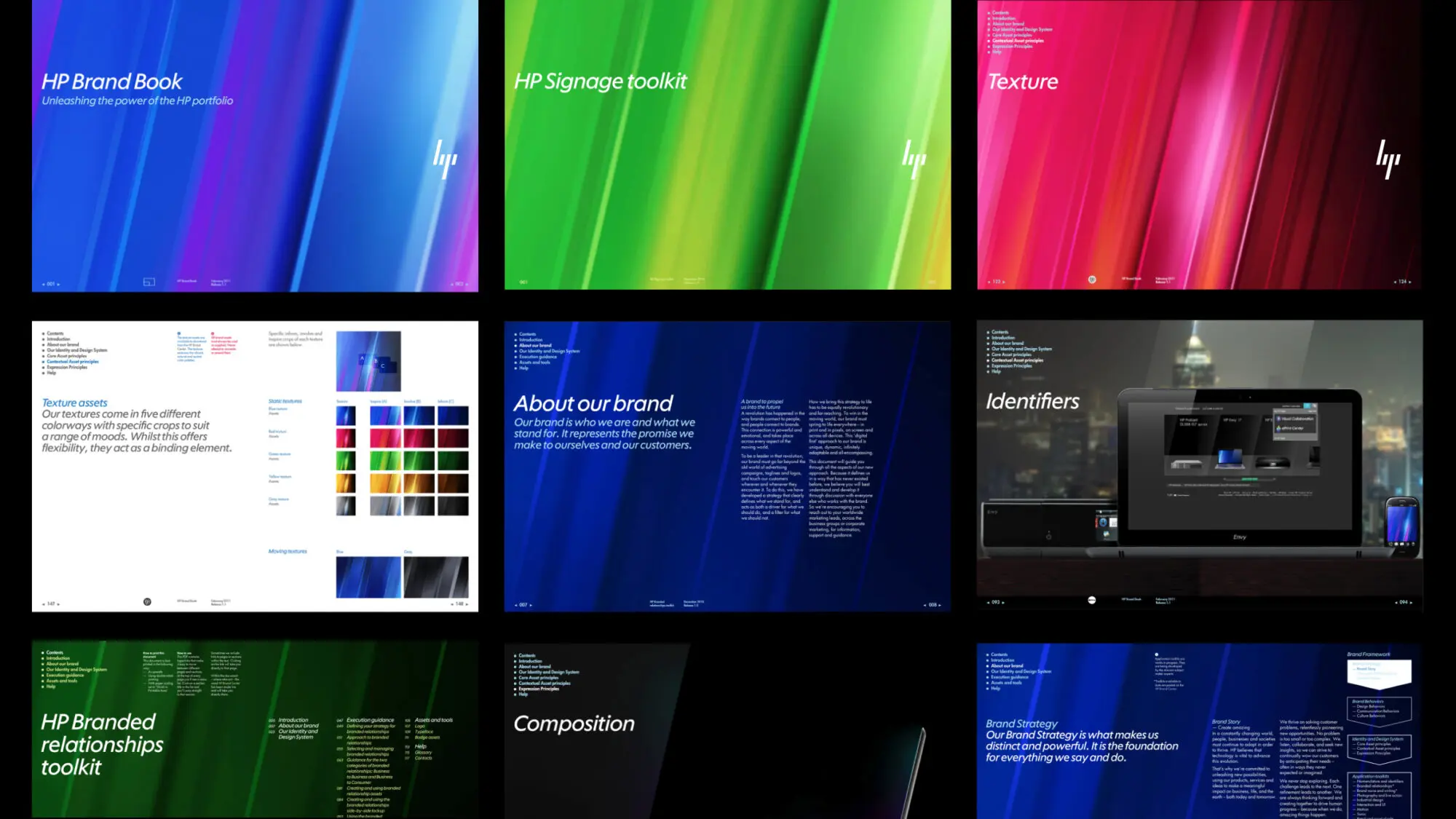
The defining signature of the living identity we designed is the forward slant originally found in Hewlett and Packard’s 1941 original company logo. Rooted in its heritage, this 13º angle simultaneously represents HP’s forward momentum towards the future. It also refers to the world of computing by recalling the forward slash used in programming. We embedded the 13° in the brand identity, driving the design of graphics, products and experiences.
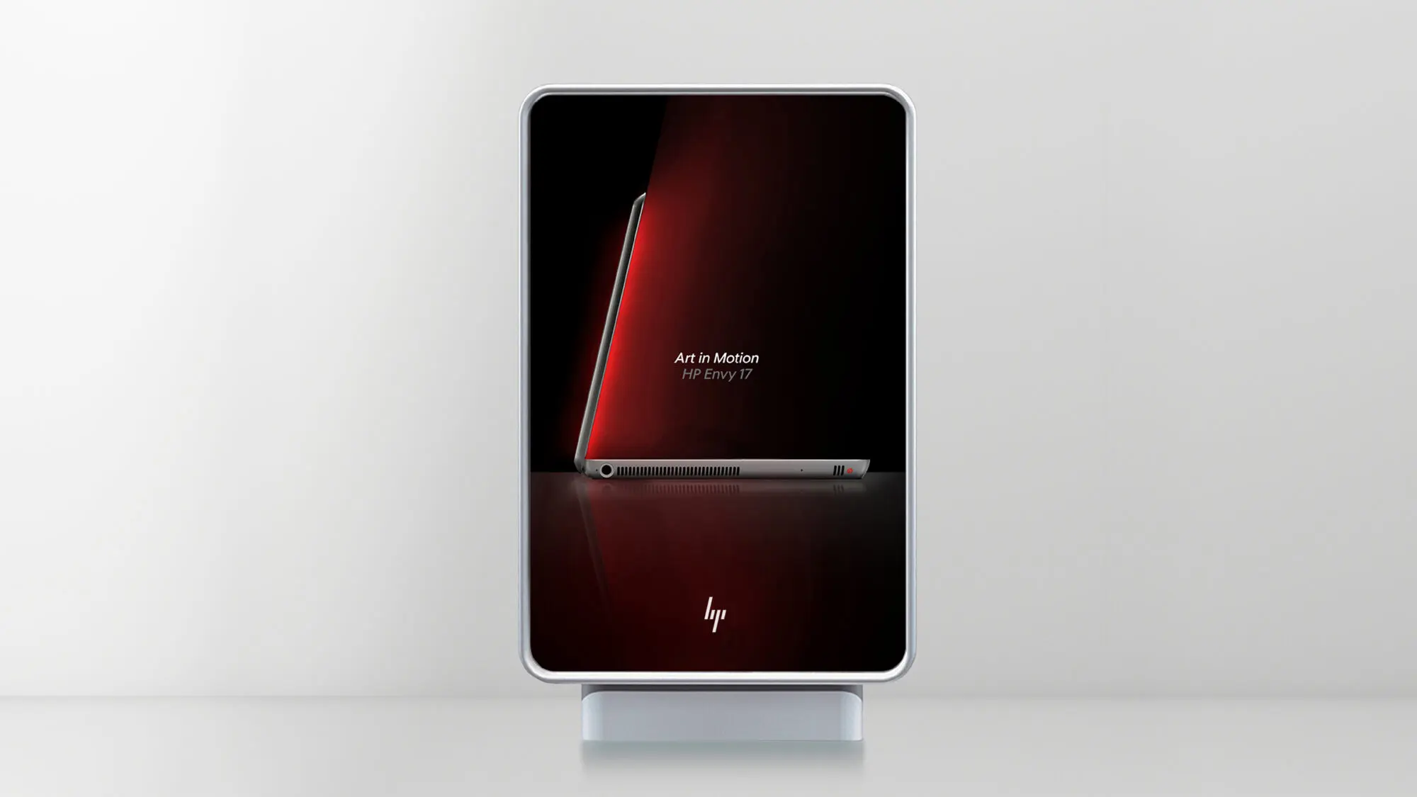
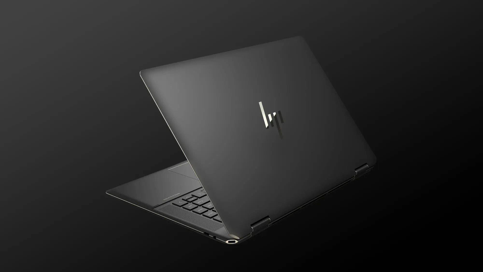
Perhaps most famous is the symbol we created. The four 13° diagonals that form an abstract version of the HP insignia were an unambiguous signal of a company on a mission of renewal. With HP undergoing internal upheaval, it took several years before the mark finally emerged in 2016 on selected premium HP products, those four ultra-refined, forward-leaning lines causing an immediate stir.
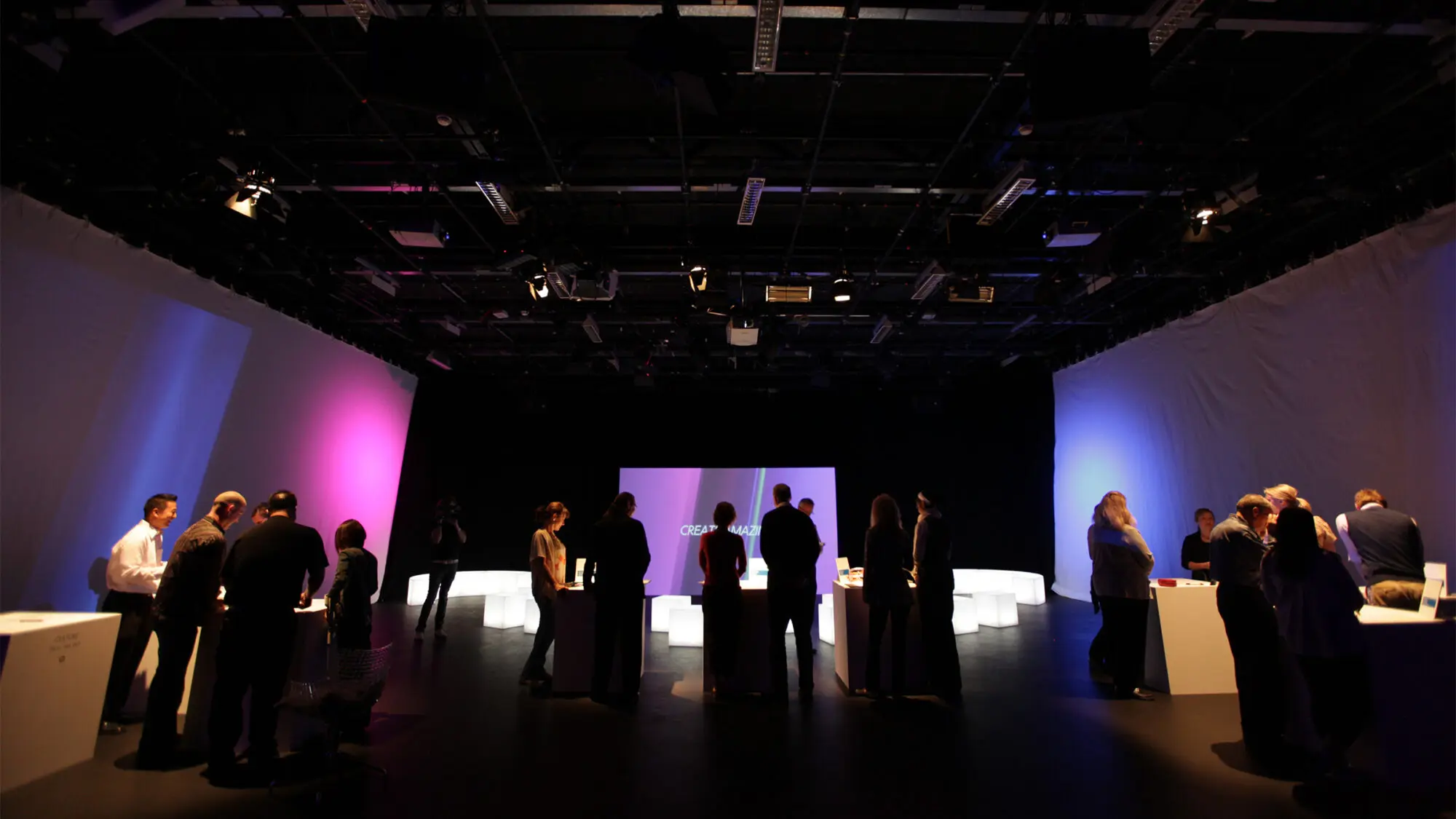
Our partnership helped align the HP portfolio behind a compelling vision and new master brand strategy and identity. Our work served as an inspiration for numerous businesses and over 300,000 employees worldwide, rallying them behind a unified purpose, behaviours, and design system that still guides new product releases to this day.
‘We wanted the best creative partner in the world, so we went to Moving Brands.’Glenna Patton VP of HP Brand Strategy & Experience Design