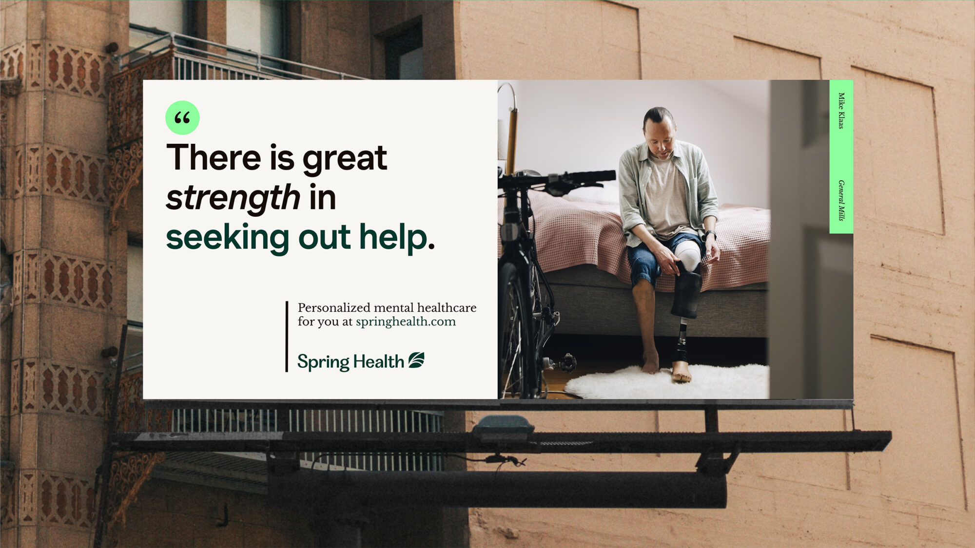
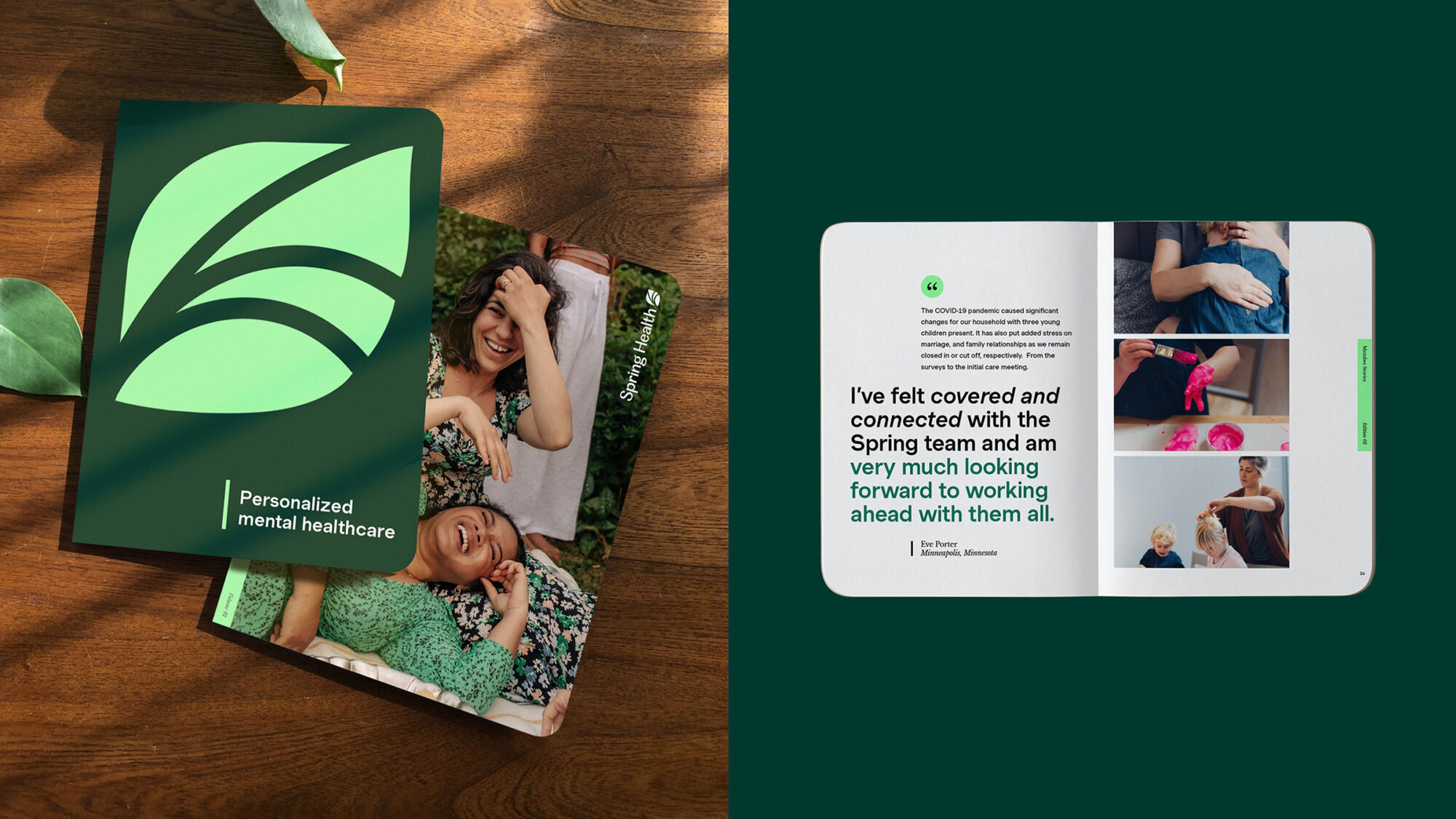
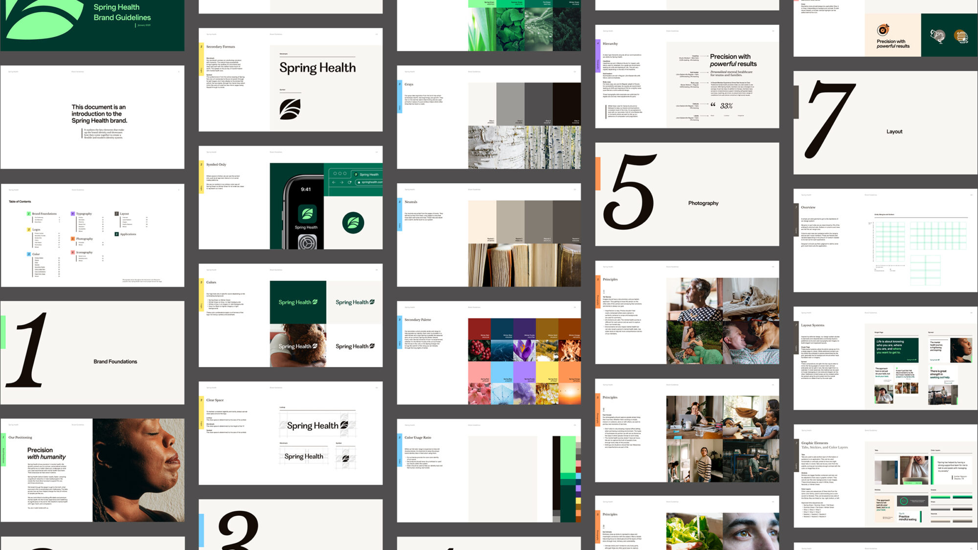
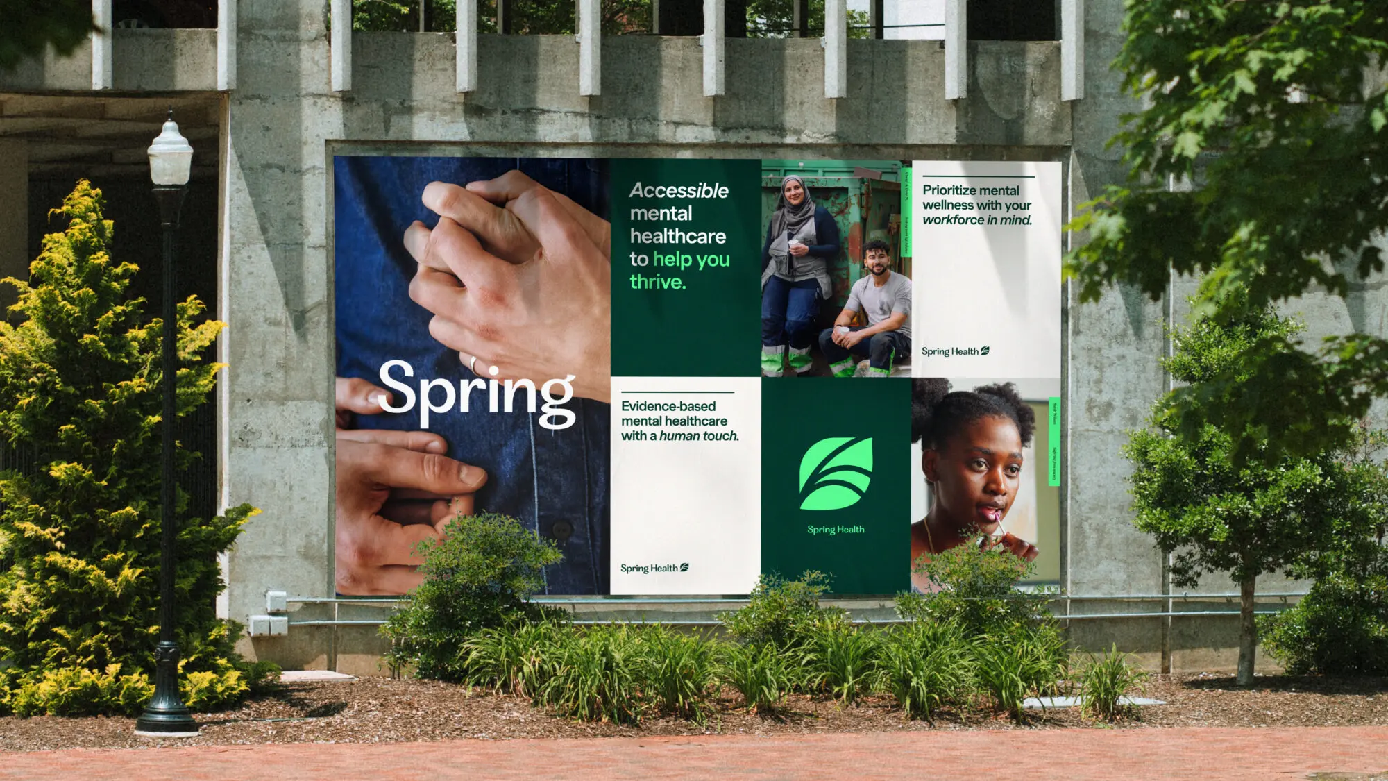
Building trust across diverse audiences

Our task was to create a consistent, unified brand while addressing the tension between a pragmatic, clinical approach and a desire to be relatable and warm, building genuine trust across diverse audiences. We designed a brand system that evokes a sense of safety, connection and intent, with a core sentiment of “precision with humanity.”

A moving narrative

By exploring the many meanings of the word “spring,” we created a rich and evocative narrative that speaks to growth, transformation, new beginnings, and purpose.

An evocative logo

The rebrand also highlights the importance of hearing and understanding the stories of those Spring Health seeks to help, and the idea of turning a new leaf became a central motif. We worked closely with the internal team to craft a bespoke logo that combines a custom wordmark with an evocative symbol that honours the brand’s origins while looking ahead to a new chapter.

A complete & compelling brand system

Detailed art direction principles, a flexible library of graphic elements, and a colour palette born from the story of nature-driven growth work together to help tell an honest and engaging brand story that fearlessly lifts the veil on mental health and its fundamental importance to our lives. Our new system included strategy, positioning, behaviours, tone of voice, messaging, audience profiles, and guidelines.