A story of transformational impact
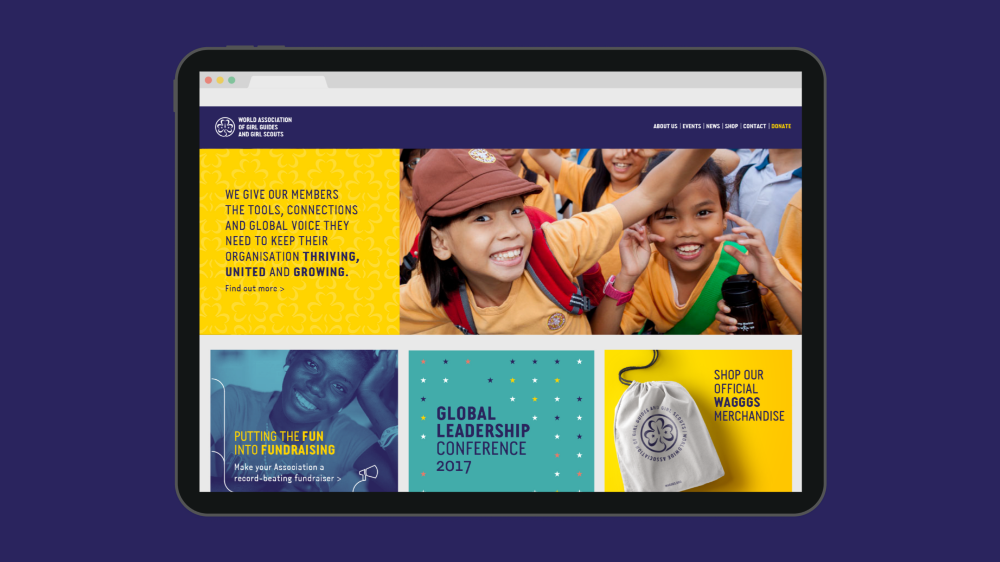
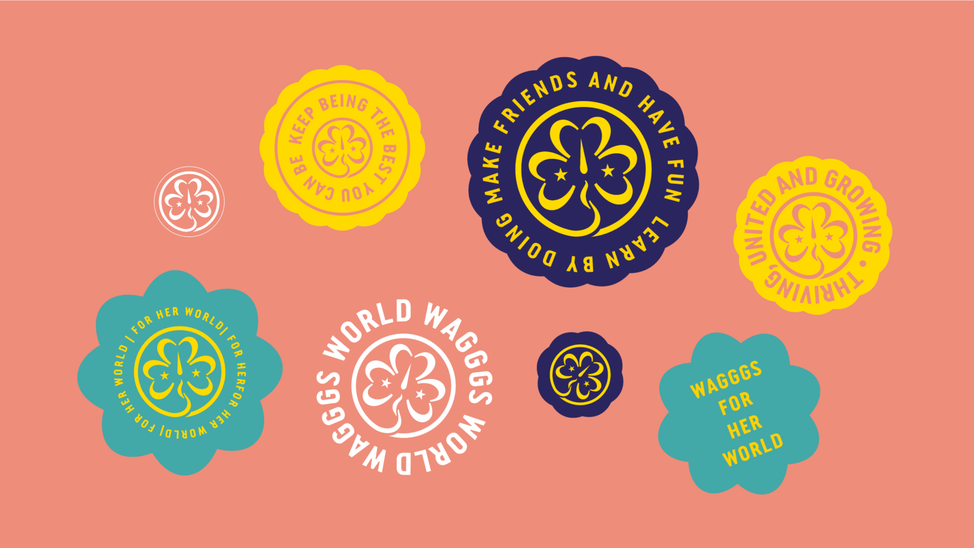
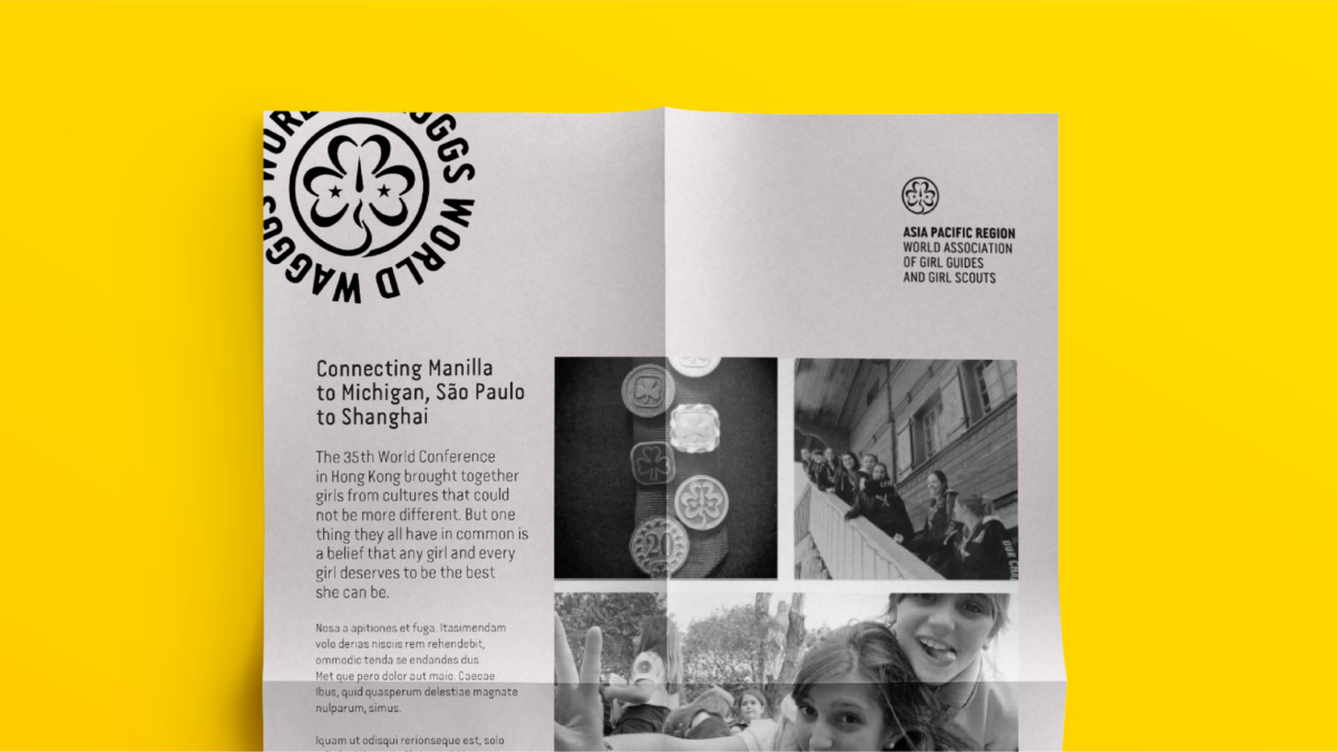
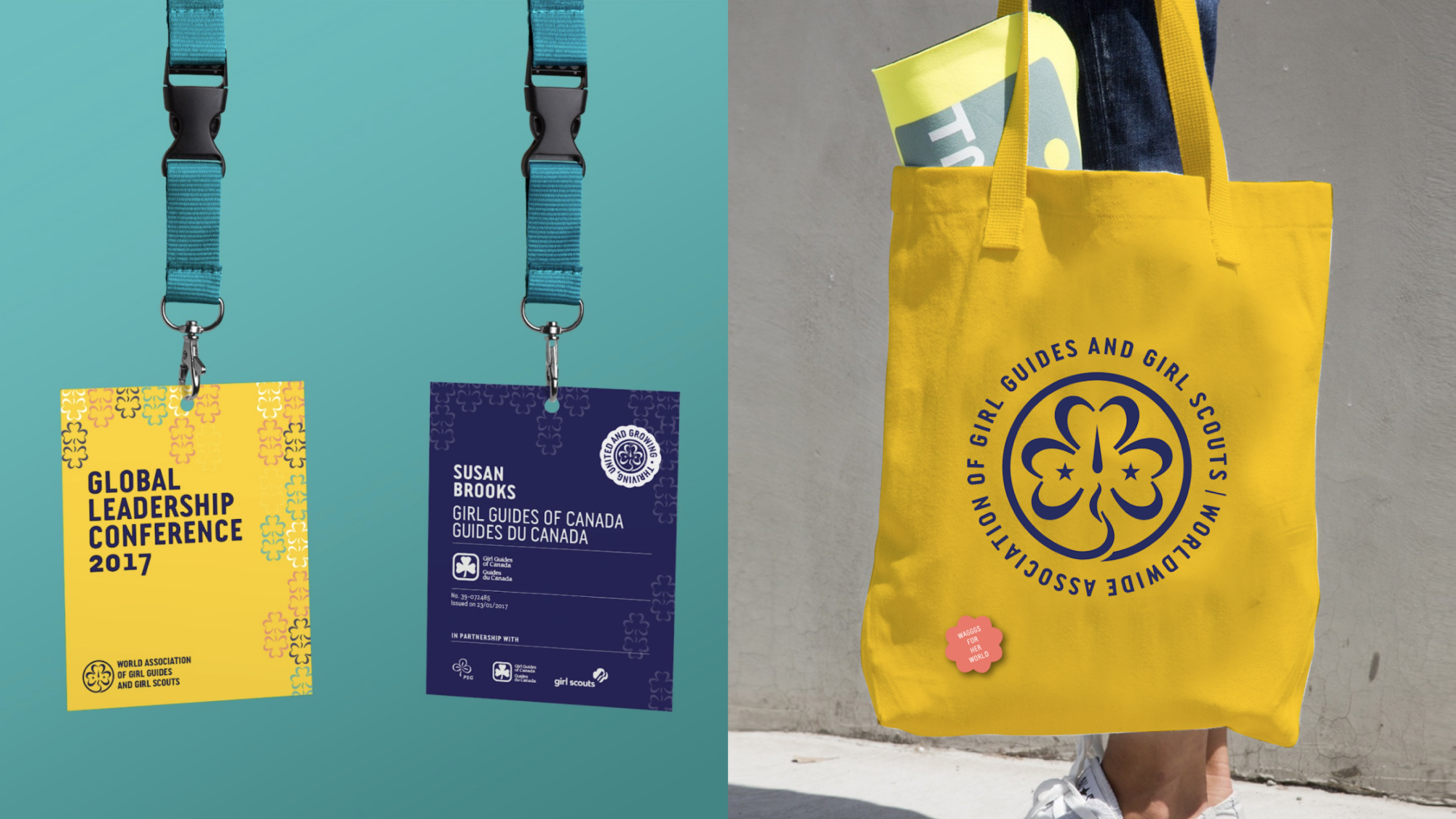
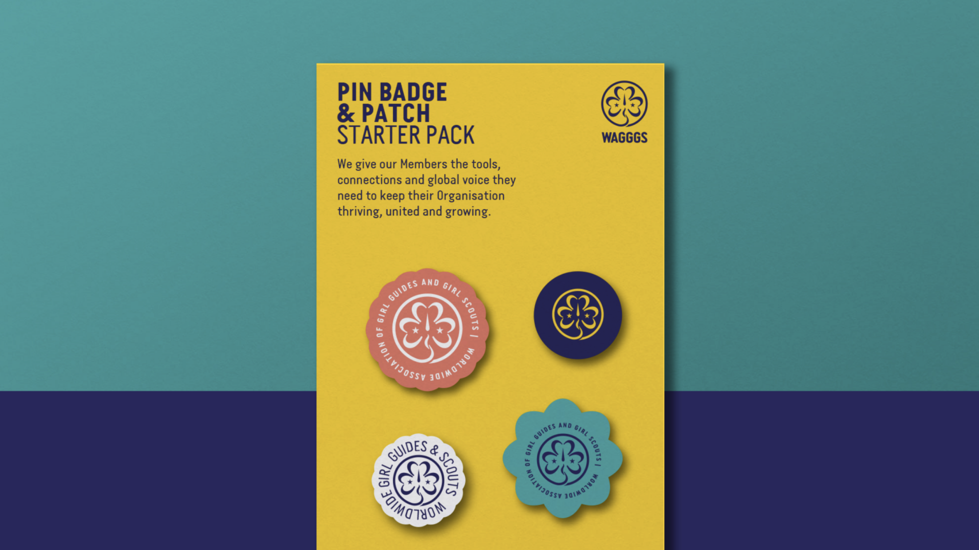
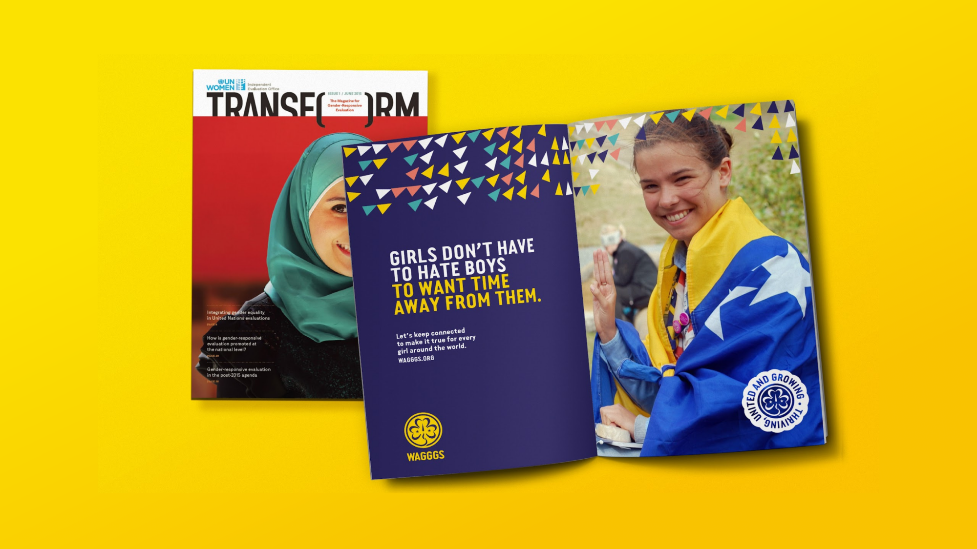
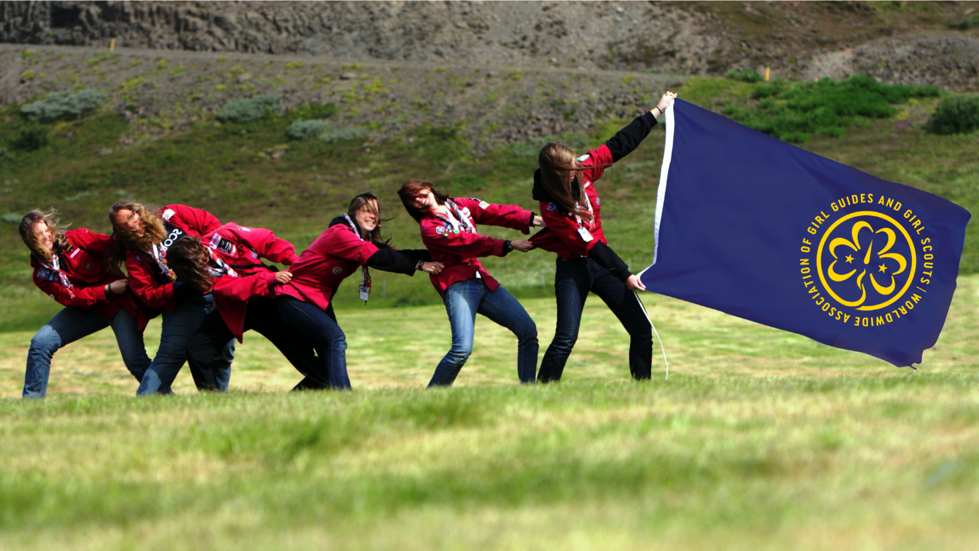
After partnering to strategically review and define the movement’s purpose and value proposition, we began work on a new brand system that would better reflect the breadth and energy of the girls’ groups they existed to support.
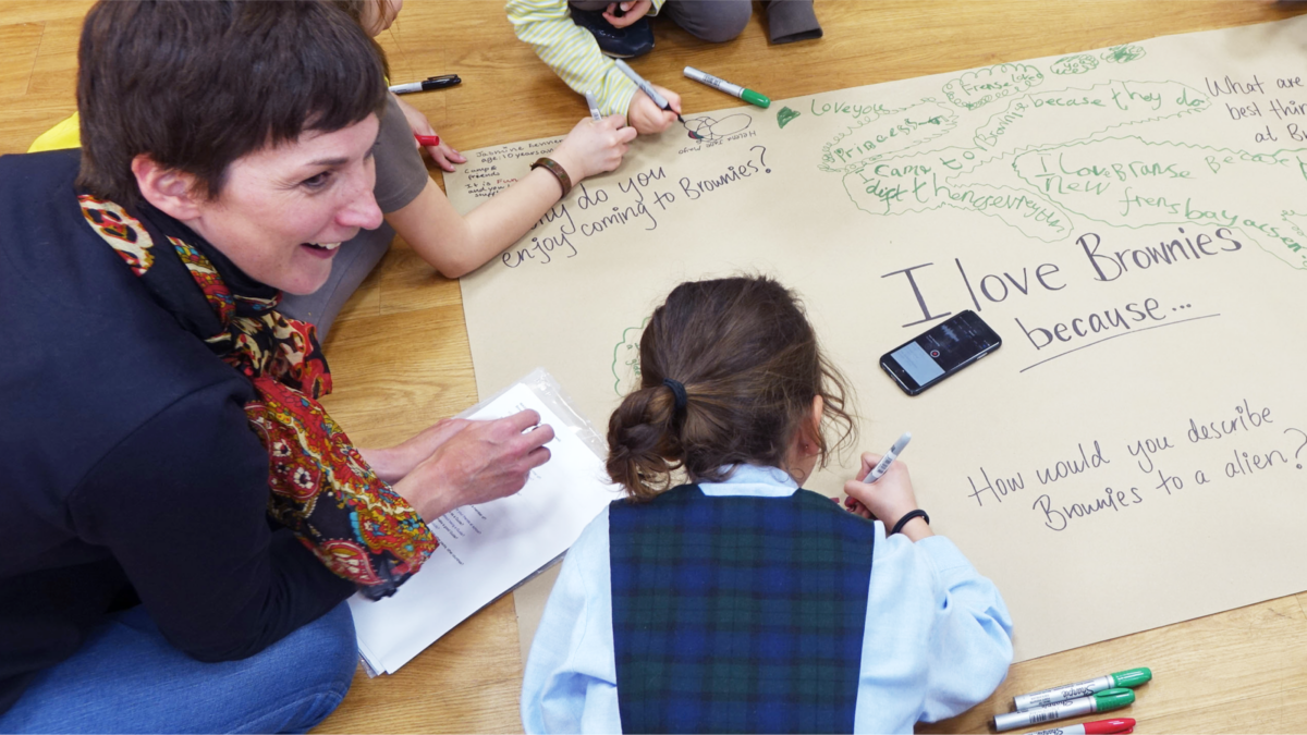
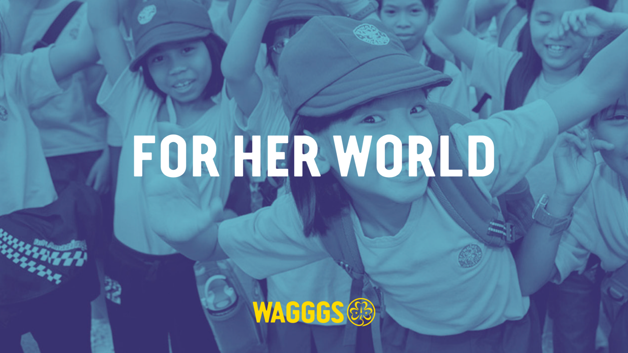
Working with volunteers and leaders worldwide, we encapsulated their essence and role in a new brand story, which captures the transformational impact Guiding & Scouting has on everything a girl defines as ‘her world’.